
Quiet Luxury Is Over: The Wealthy Are Ordering Decoration Again
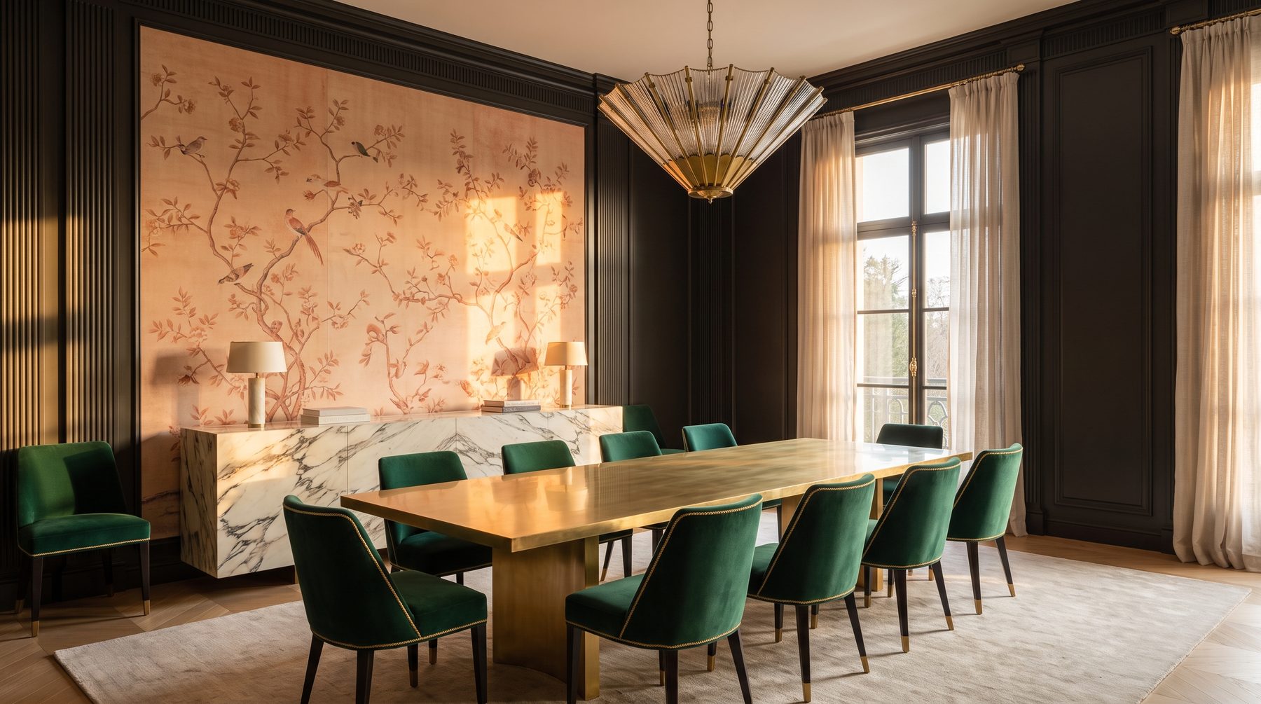
In December 2025, Pantone named a white its Colour of the Year for the first time ever — Cloud Dancer 11-4201, a weightless, serene shade of silence. Four months later, at the end of April 2026, Milan opened Salone del Mobile, and the signal colour of the season turned out to be orange. An entire era fits between those two events. The institution chose quiet; the market chose a voice. That is the new maximalism in a mansion interior: the house has given itself permission to be narrated again, not merely restrained.
We see it in the briefs of the past eighteen months. A client who three years ago asked for “nothing extra, just the texture of stone and wood” now arrives with a photograph of a hand-painted dining room and asks: can we do that, but without the museum?
Pantone picked white. Clients picked colour
Quiet luxury was an honest movement. It cleared premium housing of the gilding of the 2000s, the polyurethane mouldings, the furniture that shouted its logo. For that, thank you. But every cleansing wave has a shelf life, and it expired around the moment a beige living room with an armless sofa stopped telling one 300-million-rouble house apart from another.
Tellingly, the reversal is visible not among niche decorators but among the largest industrial players. Benjamin Moore named Silhouette AF-655 its colour of 2026 — a deep espresso with a charcoal undertone, essentially a near-black borrowed from fashion rather than from the world of safe neutrals. Farrow & Ball is betting on faded terracottas drifting into apricot-pink. Milan added ochre, warm chocolate and the saturated seventies.
Note the pattern: colour has returned not as pure spectrum but as something complex, dusty, as though it had already lived a decade. This is not a rollback to the maximalism of the 2000s. It runs on a different mechanism — and that is worth understanding before you start choosing paint.
The new maximalism is editing, not hoarding
The main misunderstanding around the word “maximalism” is the assumption that it is about quantity. More objects, more pattern, more colour. That is how the feeds serve it: a room where everything happens at once.
In practice, the season’s commentators describe it differently — as expressive editing. Not “let’s add more”, but “let’s keep what has earned its place, and stop hiding it”. The difference between a warehouse and a collection is not the number of objects; it is the presence of an editor.
Quiet luxury worked by subtraction: remove everything removable and hope the remaining oak and limestone tell the story themselves. The new approach works by selection and hierarchy: a room contains one or two pieces it exists for, and everything else is arranged to support them. A rug may be loud if the walls stay silent. Walls may sing if the furniture holds the line.
This is where most people go wrong. They read “maximalism” as permission not to choose. It is the opposite — a demand to choose harder than minimalism requires, because in minimalism a mistake dissolves into a white wall, and here everyone can see it.
Neo Deco: what Milan showed in April
Salone del Mobile 2026 ran at Rho Fiera from 21 to 26 April, and its dominant thread was what the European press christened Neo Deco. Chevrons. Polished brass and chrome. Fan-shaped and radial arches. Jewel-toned velvet upholstery. Furniture with rounded volumes that once again has a silhouette, rather than merely “a form derived from construction”.
The operative word is “neo”. Classic Art Deco was about demonstration — the interiors of transatlantic liners, where every centimetre argued for the owner’s wealth. Neo Deco takes the geometry, the rhythm and the material richness, and discards the pomp. A 2026 sofa quotes the thirties, but you can live on it with two children and a dog.
Milan’s second signal was the return of ornament. Lace, tapestry techniques, historic motifs reinterpreted in textiles and surfaces. The design director of de Gournay described this season’s mood as eclectic ornamentation, with an appetite for smaller-scale motifs behind which you sense a hand rather than a printer.
For the Russian country-house market this is a convenient coincidence. Our clients never truly fell in love with total minimalism — they tolerated it because it was the done thing. A thousand-square-metre house with entirely white walls always looked faintly like a business-class hotel. Now the impulse to add colour and detail has an international alibi.
Craft is back: painted panels, passementerie, singular surfaces
The most interesting part of the reversal is not the colour but the return of handwork as a value. That is precisely what separates the new maximalism from a simple “make it brighter”.
Three categories are moving back into premium projects.
Hand-painted panels and murals. The market reference is de Gournay: painting on silk, where a single panel starts at 1,000–1,500 dollars and climbs from there, and a complete dining room easily reaches several tens of thousands of dollars for the material alone. At the American atelier Gracie, one panel of roughly 90 × 300 cm represents 75 hours or more of handwork. You are not paying for a square metre; you are paying for months of someone’s life — which is exactly why such a wall does not expire with the season.
Passementerie. Braid, piping, fringe, cord along a curtain edge and along the seam of a chair. For a decade this counted as a mark of poor taste, along with the whole “curtain” aesthetic. Today the trim returns in a different role: not as a frill, but as a graphic line that reveals an object’s geometry. Contrast piping on an armchair works exactly the way topstitching works on a good jacket.
Decorative plasters and authored surfaces. Marmorino, Venetian polish, silk finishes, pearlescent sand, microcement — everything that gives a wall a depth no paint or wallpaper can. In premium projects the surface increasingly becomes the main event of the room, with furniture stepping back. We cover this in detail in our materials and procurement section, which lists the actual product lines the studio works with.
But here is where it gets interesting. All three categories share one property: you cannot buy them in one click and have them delivered next week. That is exactly why they became status markers — in a world where any piece of furniture can be ordered to your door, value has migrated to whatever requires waiting.
Where maximalism breaks: five typical mistakes
First — colour without architecture. Painting the walls deep green in a room with a 2.7-metre ceiling, crooked reveals and downlights scattered in a chequerboard means getting cramped, not noble. Saturated colour is merciless to geometry. It reveals everything a pale wall concealed.
Second — ornament on every plane at once. Patterned wallpaper, patterned rug, patterned upholstery, patterned curtain. Each is fine on its own. Together they fight for attention, and the room becomes exhausting within ten minutes. The working rule: one soloist, the rest accompany.
Third — handwork over poor preparation. A mural costing several million roubles on a wall with a three-millimetre wave is money thrown away. Plaster beneath authored finishes must be levelled to a tolerance markedly tighter than usual, and the wall must be dry. Ateliers that respect themselves simply will not come to a site where the substrate is not ready.
Fourth — lighting chosen for minimalism. A room with colour and texture needs different light: warm temperature, high colour rendering, directional accent on whatever the whole thing was done for. Cold, evenly spread ceiling light kills velvet, mural and brass patina in a single evening.
Fifth — maximalism without a scenario of use. Pale passementerie in a house with two labradors. Unlacquered brass in the bathroom by the pool. Silk on a panel next to the kitchen island. All beautiful — right up to the end of the first year.
Our approach: architecture first, decoration after
The studio’s position here is simple and possibly unfashionable: decoration does not rescue a bad plan. It underlines it.
So colour and ornament appear in our work only once the proportions of the room, the ceiling height, the rhythm of openings, the lighting scenario and the services have been resolved. First the architecture of the interior — then the layer that makes it personal. This does not make decoration secondary. It means decoration has to land on a prepared base, or it turns into make-up on bad skin.
We had a residence project near Moscow where the client arrived with the idea of a fully painted dining room — birds, branches, exactly as on the references. We paused and did the arithmetic: with that window placement and that ceiling height, the mural would only read on two walls out of four; the rest were closed off by furniture and openings. The outcome: one wall painted as the accent, two taken into a deep complex tone, the fourth given to a built-in buffet. The decorative budget shrank roughly threefold, and the room came out stronger than the original idea. Afterwards the client said something I often recall: “I would have paid for what nobody would ever see.”
That is how we structure the interior decoration stage: first a map of accents across the whole house — where a room has the right to speak loudly and where it is obliged to stay quiet — and only then the selection of specific materials. A house in which every room speaks loudly has no strong room at all.
How that looks when finished is easiest to see in our completed interiors — for instance in the Peonia project, where colour and the decorative layer work as a hierarchy rather than as blanket coverage.
What it actually costs
Some orders of magnitude, to keep the conversation concrete. Hand-painted walls on the Russian market start at roughly 3,000 roubles per square metre — the lower bound, artisan level. Work by a known atelier costs several times more, and there the bill is counted not by the metre but by the subject and the lead time. Decorative plasters, turnkey with material, start around 3,500 roubles per metre; ceiling application costs 50–100 per cent above the base rate, and heights above three metres add another 10–20 per cent for access. In a mansion with a double-height living room, those percentages become a budget line of their own.
From there the arithmetic turns counter-intuitive. A painted dining room wall may cost as much as a good car, yet it removes the need for expensive art on that wall, for elaborate decorative lighting, and for furniture that would compete for attention. One strong gesture is often cheaper than three compromises.
The real risk, though, is not price but time. Hand-painted work, bespoke textiles with passementerie, authored surfaces — these carry production cycles of two to six months, sometimes longer. If they are not written into the programme at the start, they drop out of the project at the last moment, and the house is handed over with temporary solutions that become permanent. We keep such items on a separate list from day one, as with everything else in interior procurement, where delivery dates matter more than the price list.
What to do with all this
Do not rush to repaint the house. Quiet luxury was not a mistake — it was a necessary pause, and its lessons about material quality and honest texture have not gone anywhere. Something else has changed: the pause is over, and silence has stopped being the only marker of taste.
A thousand-metre house without a single room that has character is not restraint. It is the absence of a decision. Premium residential architecture is moving toward the point where restraint and expression stop being opposites: a neutral base, faultless geometry, and two or three places worth bringing guests to see.
If you are at the stage where the plan has settled but the decorative layer is still undecided, this is the best moment to talk. Write to us or drop into the studio’s Telegram: we will show you what a map of accents looks like on a real house, and tell you honestly where the money is worth spending — and where it is not.

Author


Next step
Discuss your project
An hour at the studio with Oleg Reznikov: your site, your brief and relevant studio projects.