
Emerald, Terracotta, Indigo: Why Neutral Mansion Costs Less
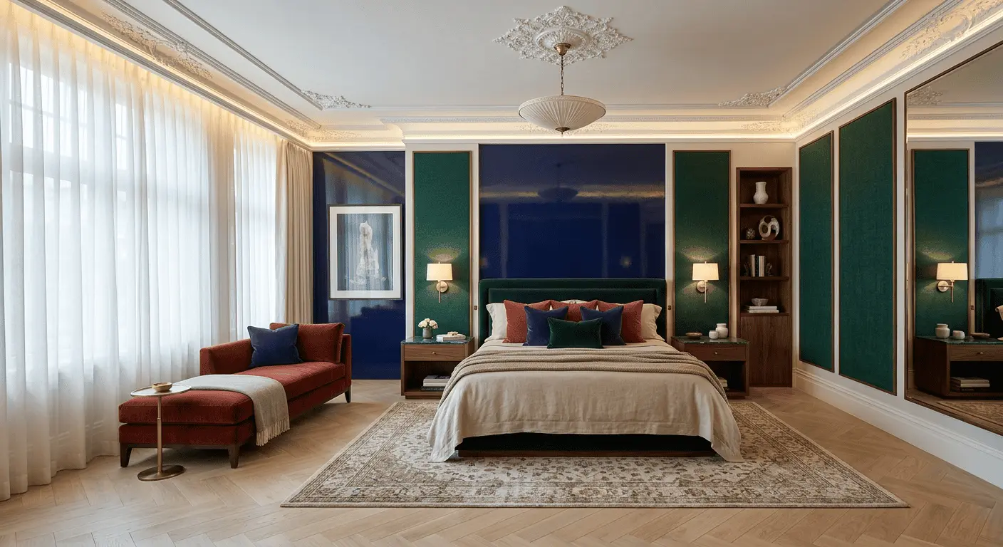
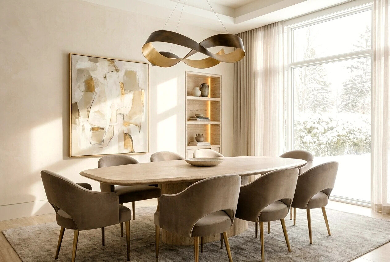
Broker called us recently, we’ve worked with him eight years. Says: “Property 1400 meters, Novaya Riga, perfect location, architecture clean-classical. Hanging eleven months. Showings go, buyers leave. What to do?” We come look. Turned out exactly what market calls “ready to move in”: beige walls, gray travertine, curtains milk-colored, furniture in cappuccino shades. Everything expensive. Everything uniform. Everything — about nothing. And here we said aloud for first time in long time what’s been formulating in practice: bold accents in mansion interior today sell house better than restrained neutrality. A paradox that market 2025–2026 already fixed with numbers.
Article — about why “safe” beige-gray house costs less than house with character. Why emerald in library, terracotta in guest wing, indigo in office — this isn’t taste risk but investment decision. And how to build color scenario in 1000+ meter mansion so facade stays austere, interior — alive.
Myth about “universal” neutral interior
Belief travels article to article, broker mouth to buyer ear: neutral interior is universal, suits anyone, so sells faster. Logic sounds right. Practice — hasn’t worked five years already.
Buyer of 300–800-million mansion isn’t looking for “ready solution for any taste”. Looking for house that triggers emotion first step from car to door. No emotion — he doesn’t negotiate up, he negotiates down. Or goes to competing object with something to grab onto.
In our practice forty-plus expensive objects passed through last two years — pattern came out rigid. Homes with tuned color drama sell average 4–7 months faster than neutral equals of same area and location. And leave closer to asked price, not with 12–18% discount become norm for “beige boxes”.
Why super-wealthy buyer responds to color
Here starts interesting. Person with fourth or fifth house in life already lived through all stages: “minimalism for minimalism”, “Italian classicism turnkey”, “full white”. Came to simple thought — house should be about him, not averaged taste from design studio catalog.
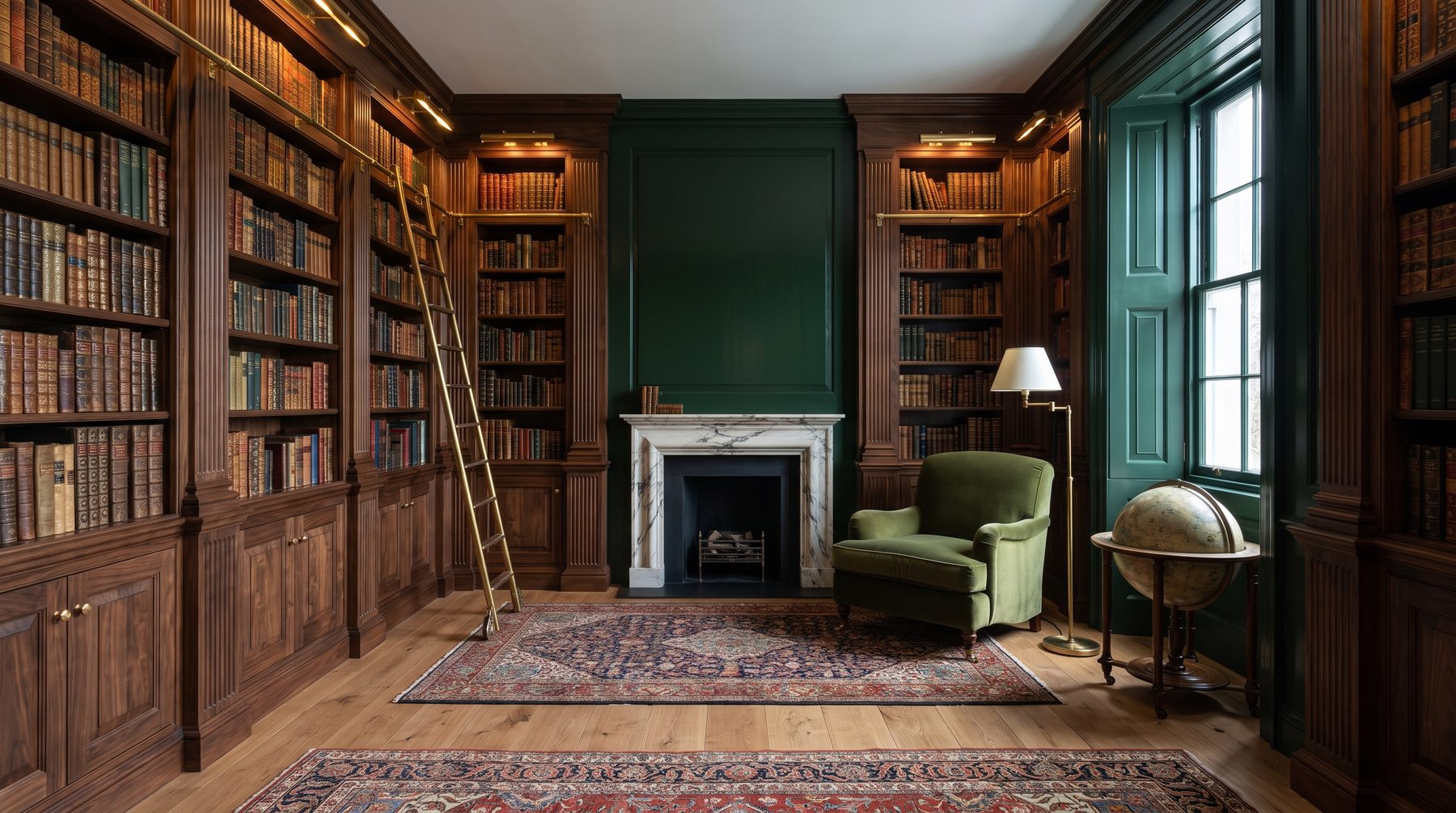
Color works on level material and layout can’t reach. Emerald library with dense velvet walls reads as statement: we read here, we think, we don’t hurry. Terracotta dining promises long dinners and real food, not blender smoothies. Indigo office — about focus and power to decide. This isn’t decor. This is life scenario written in color.
Beige mansion promises nothing. Neutral — means silent. And silent 500-million house — strange.
Bold accents in mansion interior: where line between boldness and bad taste runs
First caveat: we’re not talking painting walls fuchsia and putting yellow sofa middle of living room. Bold accents in mansion interior — not about shout, it’s about precision. Difference between “bold” and “scary” runs on three lines, each we hold hard in studio.
First line — depth, not brightness. We almost never take pure open colors. Not emerald, but emerald with black and gray share. Not terracotta, but terracotta with dust and ochre. Not indigo, but indigo moved to graphite. These tones don’t tire eye over ten-year house life — unlike “trendy turquoise” from which in year want to escape.
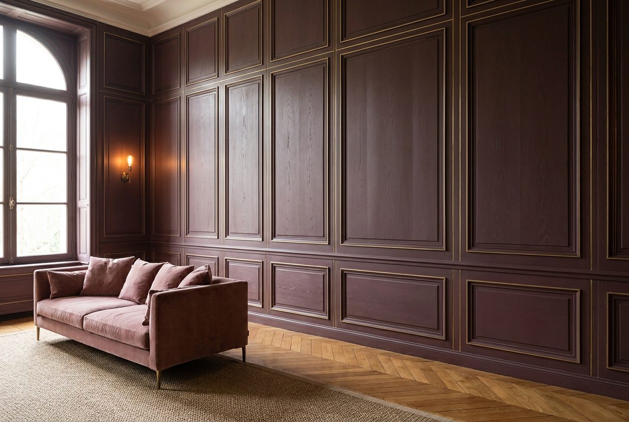
Second line — material where color lives. Emerald in matte paint on drywall — cheap. Emerald in velvet long-nap, in eucalyptus veneer or glazed ceramic tile — completely different story. Color without noble material doesn’t work. Tested on dozens of objects.
Third line — dosage. In 1200-meter house colored rooms can’t be ten. Three-four, max five. Rest — complex neutral backgrounds giving colored zones room to sound. Without silence, no music.
Case: how color added 38 million to appraisal
We’ll tell without names. End 2023, house 1650 square meters on Rublyovo-Uspenskoe direction. Owner wanted to sell, three-broker appraisal converged at 540–580 million. Interior — standard expensive beige, all by rules, all faceless.
We offered not sell like this, first do spot rethinking — five zones, four months work, budget around 22 million. What we did: library into dark emerald (velvet panels, veneer, bronze), dining into muted terracotta with travertine and raw brass, office into indigo with English oak, guest bedroom into dusty-rose with ochre, wine cellar into deep wine-burgundy. Facade didn’t touch. Main living room, main living, master stayed in noble neutrals — pauses between accents.
Object went for 618 million in seven weeks after listing. Math simple: invested 22, got appraisal jump 38–60 million and cut exposure time many times.
Typical mistakes those who decided “add color”
Section worth reading twice. Because when owners hear about color accents, they do same mistakes most often.
Mistake one — color on grand interior facades. Paint grand living room in emerald — this isn’t bold, it’s overreach. Grand zones must stay restrained. Color lives in private and semi-private: library, office, dining, guest bedrooms, dressing room, wine cellar, billiards.
Mistake two — colored walls with neutral furniture. Dark-green wall and beige sofa — provincial hotel interior. Color must be supported by materials and textiles on multiple levels: wall, carpet, upholstery, curtains, accent piece. Otherwise reads accidental.
Mistake three — trying “freshen up” trendy color. Mint, lavender, Pantone-of-year — all this dies by sale moment. Work only archive colors: emerald, terracotta, indigo, burgundy, ochre, dark chocolate, muted mustard. These tones were noble hundred years ago, stay noble another hundred.
Mistake four — without architect and without color map. Can’t pick wall color separate from bathroom tile, separate from floor wood, separate from light fixture metal. House — system. Bold accents in mansion interior work only when built into single score, not collected from random “I liked picture” decisions.
Mistake five — color symmetry. If library is emerald, doesn’t mean office opposite should be emerald “for balance”. Balance created by contrast, not repetition.
How we build color scenario in 1000+ m² house
Our approach — always from overall dramaturgy to pinpoint decisions, never opposite. We don’t start asking “what color paint library”. We start asking “what life will family live in this house and where emotional stress points are”.
First step — route map. How person moves through house morning, day, evening. Where stops, where passes through. Color accent zones put at stopping points — where eye lingers, where person spends hour-two, not fifteen seconds.
Second step — light map. Color gorgeous in north light can look dirty in south. Emerald in north-window room — luxury. Same emerald in noon south room without proper shading — swamp. We always test colors on object, in real windows, different times. Never decisions by samples on monitor.
Third step — material score. Under each accent color select own material set. Emerald usually has: matte velvet, eucalyptus or dark walnut veneer, polished bronze, black marble with green vein, slightly aged brass. Terracotta — travertine, raw clay in fireplace finishing, reddish-toned oak, copper, linen textiles without shine. Indigo — dark oak, brushed steel, black leather, chunky knit wool.
Fourth step — check by time. We always ask client: “Ready live with this color ten years?” Doubt even slight — tone down half-shade. Expensive interior can’t need redoing in three years.
Bold accents in mansion interior and classicism facade: won’t it tear?
Frequent owner fear: if inside color and character, won’t that clash with classical light-stone facade? Won’t it feel “inside one thing, outside other”?
Answer: no, if done right. Classical facade architecture — it’s promise of quality, status, substance. Color accents inside — it’s promise of life, individuality, depth. These two promises don’t contradict, they complement. Opposite: strict white or light-ochre facade makes colored interior many times more powerful by effect. Contrast works both ways.
Key is transition node — entry group, hall, grand staircase. Here color always restrained: complex neutrals, noble stones, dark-wood. This is pitch fork tuning visitor before they enter colored rooms. Without this tuning, transition from white facade to emerald library will indeed feel shocking. With it — this is dramaturgy, not tear.
What this means for investment logic
If looking at house as asset — and in 1000+ m² segment it’s always asset, even if for living — bold accents in mansion interior work as lift coefficient. Make object recognizable, emotionally charged, distinguishable from hundred same beige houses in same location.
Market saturated neutral objects. Many, similar, compete only price. House with character exits that price competition — sells to buyer who fell in love. And love-struck buyer doesn’t negotiate down. Basic deal math we observe five years straight.
Second — horizon of resale. Correctly-done colored interior lives fifteen-twenty years without moral aging because used tones and materials by definition out of fashion. Beige interior also survives fashion, but doesn’t add value, just doesn’t hinder.
Live ending
We in Reznikov Studio long ago stopped treating color as “risk to overcome”. Color — tool, as precise as facade proportions or wall thickness from clinker brick. Can use wisely and get house worth more than itself. Can use unwisely, then all “bad taste” fears prove founded. Difference — in those whose hands lead project.
If building now or considering home reload — think not about which color is “safer”. Think what life scenario you write in those walls. Bold accents in mansion interior — not about fashion, not about boldness. It’s about house honesty toward owner.
Will be happy to discuss your project — come by studio, bring plans, show our cases not from renders but real objects.
Next step
Discuss your project
An hour at the studio with Oleg Reznikov: your site, your brief and relevant studio projects.