
Calacatta or Portoro: which marble outlasts fashion
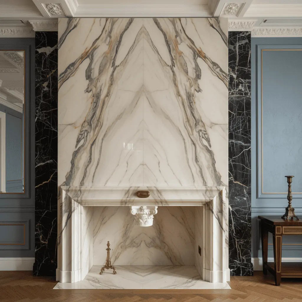
Had a project in the Moscow region — a 1,400-square-meter residence, client used to the best. At our first meeting he put two samples in front of me and said: “Oleg, you pick.” It was marble Calacatta Portoro — the building isn’t even up yet, but the stone decision is already burning. He wanted me to point. I didn’t.
Because “Calacatta or Portoro” isn’t a question of taste, not even budget. It’s about the whole house’s tone. In fifteen years one of these marbles will stay appropriate, and the other will turn into a dated detail — like a burgundy leather sofa from 2007.
Below I’ll break down honestly: where white Italian works, where black with gold does, and why in our practice the winner isn’t the one that costs more.
Two stones, two philosophies
Calacatta is quarried in the Apuan Alps, Carrara region. White ground, large gray-gold veins, noble pattern. This is a stone Romans knew before they even invented “premium.” Michelangelo chose blocks there.
Portoro — different story. Black ground, gold veins, quarried in Liguria near La Spezia. Small deposit, limited extraction, each slab almost jewelry. Per square meter, good Portoro Extra can cost two to three times more than Calacatta.
But more expensive doesn’t mean better. And here’s why.
Character: light versus theater
Calacatta works with light. It absorbs, reflects, diffuses. In an interior with panoramic windows — and in 1000+ square-meter homes this is the norm — white marble becomes daylight’s continuation. It doesn’t dominate. It holds the stage.
Portoro works with darkness. It’s theatrical, concert marble, needs artificial light — targeted, directed, warm temperature. In daylight, good Portoro looks heavy. In evening light it transforms to treasure.
I’ve formulated it this way for myself: Calacatta is marble of architecture. Portoro is marble of decoration.
The difference is fundamental.
Where Calacatta marble works: mansion scenarios
In a large residence, Calacatta thrives in three zones.
Main hall and state staircase. Here stone sets the home’s tone. If architecture is calm — classicism, neoclassicism, modern with ordinal memory — Calacatta feels native. Book-matched slab on a stair wall still works flawlessly.
Kitchen-dining. Island from a solid Calacatta Borghini or Calacatta Vagli slab is a story that won’t age. Key — don’t lacquer to mirror. Honed or light satin finish ages more beautifully than gloss.
Master bathroom. Here Calacatta is in its element. Light, water, whiteness. Important — thickness: 20mm floor in a large bath looks cheap. Minimum 30mm with edge buildup.
I had a client once who insisted on polished Calacatta throughout the first floor. After two years we were redoing it. Not because the stone is bad — because gloss across 400 meters turned the home into a business-center lobby.
Where Portoro works: always punctual
Portoro is marble of accent. Never — background. Remember this and save millions.
Scenarios where it works flawlessly:
Fireplace. Portoro portal in a living room with dark walls and low artificial light is something that in fifteen years will look as strong as today. Fireplace is a natural focus, and black stone with gold amplifies its drama.
Bar or smoking room. Counter, barbecue, wall fragment. Portoro in small doses — like truffle.
Guest bathroom. Not main — exactly guest. Small space, strong gesture. Contrasting sanitary ware, brass, dim light — and a visitor leaves impressed.
What I advise against: Portoro-clad kitchen island, state staircase, or (saw this too) swimming pool. In seven to eight years this starts reading as “person showed he could afford it.” The worst thing a home can communicate.
Why Calacatta and Portoro can’t be mixed randomly in a mansion
Most common mistake of recent wealthy interiors — using both simultaneously. Calacatta in bathrooms, Portoro in kitchen, some onyx in the bar. Looks like a catalog, not a home.
If you mix — follow rule “one main, one accent, period.” Calacatta as dominant across the home, Portoro — single concentrated gesture in one place. Or reverse, but that’s harder: dark stone needs dark architecture.
And never — both marbles in one room. They start competing and both lose.
Typical client mistakes
Twenty years brings roughly the same stumbles. I’ll list the main ones.
Buying by small sample 10×10 cm. Marble is pattern. On small fragment you see color but not slab composition. Minimum for viewing — entire slab vertical in daylight. Serious suppliers (Antolini, Margraf, Citco) this is standard — you go and select specific blocks.
Saving on thickness. Flooring marble thinner than 20mm in a big home sounds hollow. Step echoes. Counters without 30mm thickness and edge buildup look like IKEA in premium wrapping.
Polishing everywhere. Glossy marble trended in 2000s. Current standard — honed, brushed, leather. Age beautifully, hide scratches, don’t turn the home into business-center.
Ignoring maintenance. Calacatta is porous. No sealing, red wine leaves mark in twenty minutes. Portoro slightly more stain-resistant but fears acids. Lemon juice on a bar counter — matte crater on black ground.
Buying remnants. Big projects need slabs from one block — so cutting pattern aligns. Books early, sometimes a year before installation.
How we choose marble at the studio
In our practice, marble decision always follows architecture decision, not before. First — volumes, light, material palette of the whole home. Then — what marble fits.
I always ask a client: “How do you want your home to feel in fifteen years?” If answer is “calm, light, quiet” — Calacatta as base. If “character, expression, status” — variants exist, but almost never full-home Portoro. Portoro works as exclamation mark. Exclamation mark on every page isn’t text, it’s hysteria.
We take clients to warehouses in Verona and Carrara. Not showing off — part of process. One hour among real slabs saves six months of rework.
What outlasts fashion
Back to the beginning. That client with two samples picked this way: Calacatta Borghini across state zones, kitchen, main bath. Portoro Extra — only fireplace portal in the library. One gesture. Concentrated.
Six years passed. I visited him this autumn. The home hasn’t aged a day. And most important — it doesn’t look like a 2018 magazine illustration. It looks like a home.
Short answer to the headline question: Calacatta outlasts fashion — as background, as architectural base, as stone of calm power. Portoro outlasts too, but only if applied precisely and consciously. Any attempt to make Portoro the home’s hero will read as dated gesture in ten years.
And one more thing. The most beautiful homes I’ve seen in twenty years were never built from the most expensive stone. They were built from the most right stone for the architecture. That’s material honesty.
If you’re in choice stage now — come by, we’ll look together. Better to spend an evening on conversation than redo floors later.

Author
Next step
Discuss your project
An hour at the studio with Oleg Reznikov: your site, your brief and relevant studio projects.