
Emerald or Terracotta: Which Accent Will Devalue the Living Room by 2027
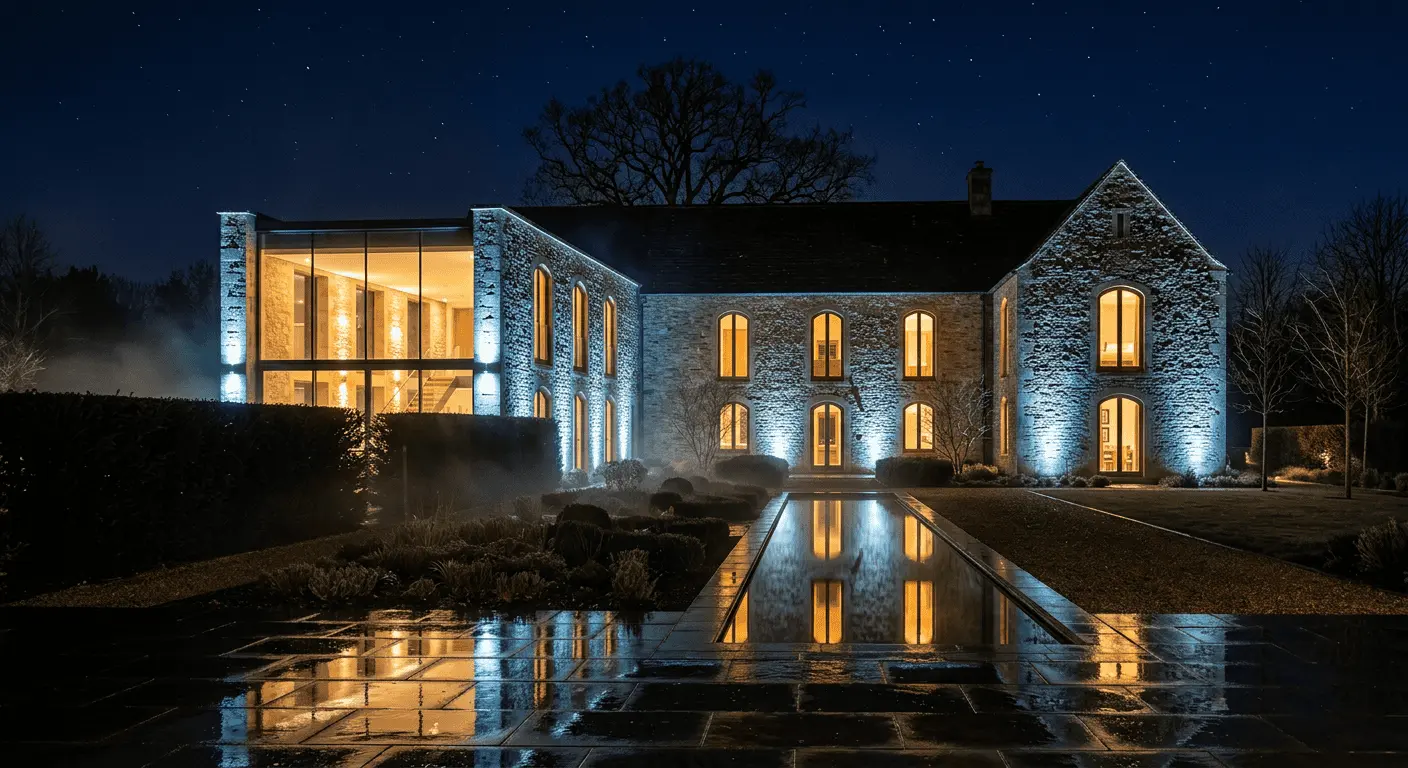
A client calls us. Mansion on Novaya Riga, 720 square meters, handed in 2022. Voice tired: “Guys, I feel the living room aged three years harder than me in ten. Come look”. We come. Architecture — good. Layout — works. Materials — honest. And the living room really does look like a magazine photo from 2021, forgotten in glossy cover.
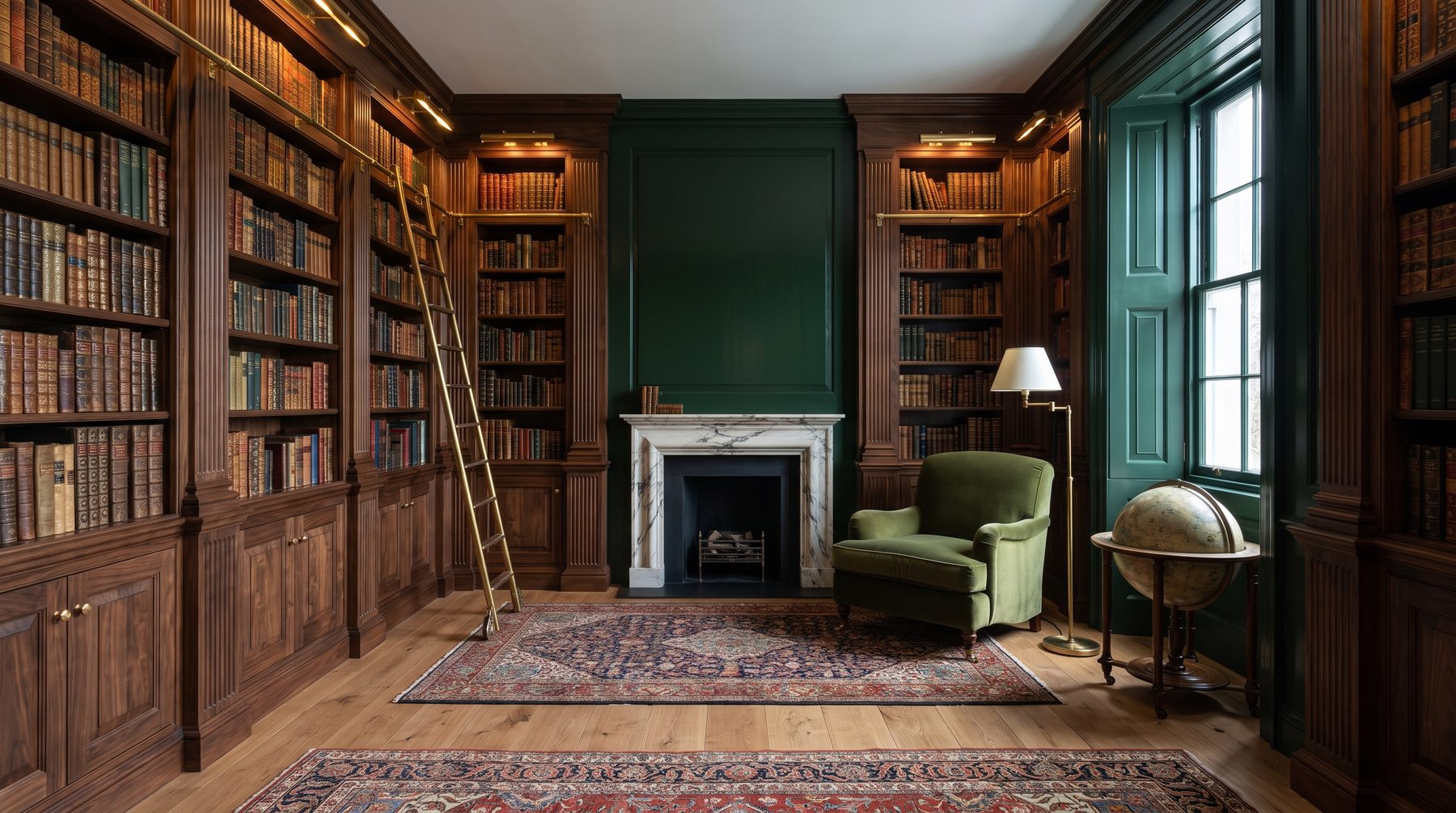
Problem was in one wall. Emerald velvet, boiserie, brass. Three years ago — daring and expensive. Now — “oh, remember everyone was doing that”. And here comes conversation we lead with almost every client: bold accents in mansion interior — this is most powerful and most treacherous tool of modern classicism. It can make space, or can void budget in one season.
This article — not about fashion. We don’t guess Pantone. We break down why some colors age in three years, others in thirty, and how to choose accent if you look at interior as asset.
Why exactly color ages fastest
In interior there are three durability layers. Architecture — stone, wood, form — lives 30+ years. Functional materials — hardwood, floor stone, joinery — 15–20. Wall finish and textiles — 7–10. And bold color accent, if it’s bright and trendy, — maybe 3–5 years max.
This isn’t tragedy. This is perception physics. Color — most emotional thing in interior, so it first catches “time’s stamp”. You instantly date a photo by wall color — without realizing. Gray-beige with lilac accent — 2014. Dusty rose and Calacatta marble — 2018. Emerald with brass — 2020–2022.
Guess what will be “2024–2025” in couple years?
List of colors that will go into “expensively outdated” by 2027
We don’t love such lists — there’s always simplification. But since we promised provocative specifics, here’s our forecast built not on trends but on market saturation. When color becomes mass-market, it’s doomed.
Emerald (deep botanical green). Overdosed itself. From 2019–2022 they painted every second “status” living room from Patriki to Rublyovka in it. Velvet, kitchen fronts, baths under malachite. When color becomes marker of “I know what’s fashionable”, it’s already dead. Emerald will last till 2026, by 2027 will read like turquoise drop ceilings — symptom of era.
Terracotta and burnt ochre. Hero color 2022–2024. Warm, earthy, “Italian”. Problem — it didn’t come alone, but in package: terracotta wall, travertine, beige boucle, reddish-toned wood, handmade ceramics. This package is so recognizable that in two years will read as uniform. And uniform — opposite of luxury.
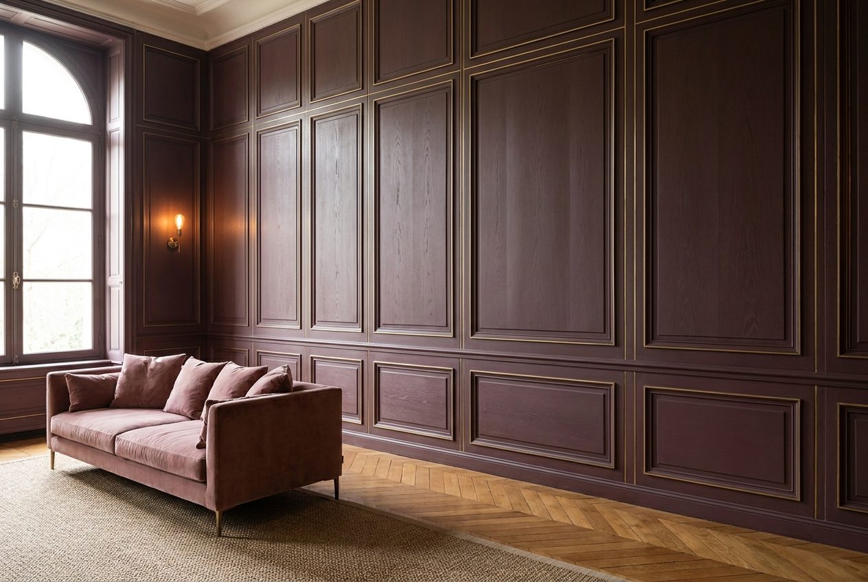
“Marsala” and burgundy in furniture. Already not accent but atavism. If you have burgundy velvet sofa in 2025 — either it’s 1960s antique or mistake.
Saturated mustard. Lasted longer than deserved. Done. We let go.
Cold gray-blue (“French living room”). Not loud, but that’s deceptive. It’s rigidly tied to 2016–2020 wave.
What remains? Below. But first — about main mistake.
Main client mistake: accent chosen by emotion
In 90% of cases when client comes with “I want emerald living room”, it sounds like: “I liked it at a friend’s / in a Milan hotel / in Pinterest picture”. Emotion — excellent conversation starter. Terrible — for decision.
Emotion picks color in moment. But you’ll look at interior every morning for ten years. In different light, different mood, after different news. Color that made you fall in love in showroom at warm 2700K light in November on Rublyovka will look completely different. And usually — worse.
Second side of this mistake — picking accent under specific object. “Let’s make wall to match this sofa”. You’ll replace sofa in 7 years. Wall — in major renovation. Logic should work opposite.
Bold accents in mansion interior: how we build solution with 10-year horizon
In our practice there’s rule we tell clients roughly so: accent must be either architectural or replaceable. No middle ground.
Architectural accent — stone, wood, metal, form. Travertine Navona wall. Fireplace portal from onyx. Brass inlay in floor. These things don’t age because they’re not color — they’re material. Material has texture, depth, history. Works in any light and any decade.
Replaceable accent — textiles, one furniture piece, painting, rug. What you can swap in a week without builders. Here you have right to emotion, because mistake cost — not renovation, but pillow replacement.
Everything in between — wall painted in trendy color, velvet boiserie in season trend, kitchen front of year color — this is slow-motion mine. Exactly here clients invest money thinking they create character. But create — expiration date.
Which colors actually work long-term
Here we’ll say unpopular: best bold accents in mansion interior — those already passed century test. Not because we’re conservative. Because statistics is harsher than fashion.
Deep wine-ink (almost black with undertone). Not “Marsala”, not burgundy — color English libraries kept since XVIII century. Works with wood, stone, brass, bronze. Doesn’t reveal era.
Dark blue (inky blue, not “dusty blue”). Archetype. We’ve used it 15 years, no signs of fatigue. Key — depth and cool undertone, not “2023 fashionable blue-green”.
Ochre-bone and raw clay color. Not terracotta. Difference — in saturation and tone. Bone tone doesn’t shout, it breathes. Almost impossible to “oversaturate”.
Charcoal-graphite. Not black, not gray. Eternal base for accent zones.
Notice — we never said “beige”. Beige isn’t accent. It’s background. We talk about what sounds.
Bold accents in mansion interior: our checklist before choosing
When client insists on specific color, we ask five questions. Unpleasant but honest.
Where did you last see this color besides Pinterest? If in three different friends’ interiors — congrats, you’re on wave peak. Peak wave means — only down from here.
Will this color survive if you remove all currently trendy elements? Mentally remove boucle, ribbed glass, brushed brass. Does color remain self-sufficient? Emerald without brass — often just gloomy green wall. Usually pretty dull.
How does it look in your real light? Not showroom. We always paint 1×1 meter samples and watch them in client’s interior minimum three days — morning, day, evening, cloudy, sunny.
Is this accent or compensation? Sometimes client wants bold color because feels — something missing in architecture. Trap. Color can’t fix bad layout. Can only highlight good one.
Ready for this in seven years? If answer is “well, we’ll redo” — this isn’t accent in mansion, it’s scenery. Mansion — not scenery.
Story from practice: how we redid that emerald living room
Back to that Novaya Riga client. What did we do? We didn’t repaint. That would be cheap.
We dismantled velvet boiserie — it was glued, owner wasn’t grieving anyway. Put travertine Silver portal plus deep dark-blue painted field — not trendy blue, but archive blue we mix ourselves on Lefranc pigment base. Replaced brass with brushed bronze — it ages decently, unlike shiny brass turning disco in five years.
Sofa stayed same — it was gray-coffee boucle, neutral, good. Added one accent piece — armchair in ink-cherry leather, just one. Changed painting.
Redoing budget — about 18% of original living room renovation cost. Result — room you can’t date. Neither 2020 nor 2025 nor 2030.
Conclusion we made for ourselves ten years ago: right bold accents in mansion interior — always dialogue of material and form, not pitch for fashion.
What if interior already “in 2021 trend”
Honestly — don’t panic. Don’t demolish everything.
First, see what exactly annoys you. In 80% cases — not color itself but combination: color + specific hardware + specific material. Remove one variable — interior often comes alive.
Second, work in layers. First — remove loudest (usually boiserie, wallpaper or kitchen front). Then — swap hardware. Then — add architectural element (stone, wood) that shifts focus from color to material.
Third, don’t jump to opposite extreme. If tired of emerald, don’t paint everything white. White 2025 will age faster than you think. Extremes always date.
Instead of conclusion
We’re not against color. We’re for color. Against — choosing it like buying a bag for season, by emotion, by “everyone’s doing it”.
Mansion — not seasonal thing. It’s space where kids grow, where grandkids visit, where birthdays happen fifteen years later. Bold accents in mansion interior must survive all this — and not become awkward memory.
If you’re now choosing — come talk. We don’t sell color. We help pick one you won’t stiffly redo in three years. Sometimes this means — talk you out. Usually — direct. Almost always — save money sizable as small car.
And yes, if you recognized your favorite color in our list — don’t be sad. You’re in good company. Main — don’t order renovation under it in 2026.

Author
Next step
Discuss your project
An hour at the studio with Oleg Reznikov: your site, your brief and relevant studio projects.