
Boiserie Revival: Panels That Outlived Minimalism
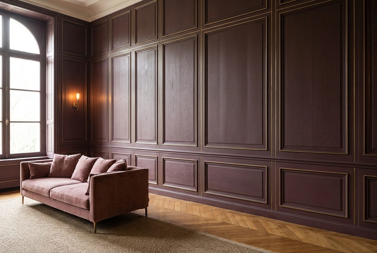
Minimalism promised us freedom from the superfluous — and for fifteen years it turned expensive homes into galleries of white walls, where the echo of footsteps was the only ornament. Then something broke. The client who yesterday demanded “clean planes” now runs a hand along a carved frame and asks why his neighbour’s walls “breathe” while his are merely painted. The answer is short: boiserie. The wall panelling that once clad the mansion of a French aristocrat three centuries ago is back — and not as a museum reconstruction, but as the most confident way to show that a house was built seriously, and to last.
Why boiserie outlived minimalism, and minimalism didn’t
Boiserie (French for “woodwork”) was born not from fashion but from engineering. In the 17th century, in the age of Versailles, oak panels were used to cover the cold stone walls of palaces: wood held warmth, muffled sound, and gave the hand a texture it wanted to touch. This was not decoration laid over architecture — it was the architecture of the wall itself, broken down into fields, pilasters and cornices according to strict proportion.
Minimalism cancelled all of this in a single gesture. It was the manifesto of a generation tired of their parents’ gilding, and in that role it honestly served its decade. But a bare wall has a limit: it does not age well, does not forgive dust, does not hold silence, and after five years starts to look not ascetic but empty. A panel ages differently — like good shoes or an old book. That is precisely why, when the pendulum swung back, what returned was not the plastic moulding from the DIY store, but genuine joinery.
Here is where it gets interesting. The design industry didn’t simply “remember” panelling — it re-engineered it. Slatted and routed fronts, fluting, plain fields for painting, veneered boards with book-matched grain now sit alongside textured plaster, brass and stone. Boiserie has stopped being a synonym for a stuffy study full of hunting trophies and become a tool that works equally well in neoclassicism and in a calm contemporary interior.
Wine, aubergine, grass green: the colour that makes a panel expensive
The panel is half the story. The other half is the colour it disappears into. And here 2026 has arranged everything with almost demonstrative clarity. The British maker Little Greene named its colour of the year Adventurer — a muted wine-aubergine, a “reassuring plum”, in the brand’s own words. Its creative director Ruth Mottershead speaks openly of “a natural progression toward burgundy and warm honey tones”. Graham & Brown answers with its Divine Damson, a dramatic deep plum. The trend reads without a translator: white has left, and colour with character and the depth of wine has arrived.
Why wine, and not the familiar beige? Because deep colour and the relief of a panel amplify each other. On a flat wall, burgundy looks aggressive, almost like paint in a fitting room. On boiserie it unfolds: light catches every edge of the field, shadow sinks into the depth, and the very same shade reads as dark chocolate by day and aged wine by evening. We call this “a wall that has a time of day”. No flat surface can do that.
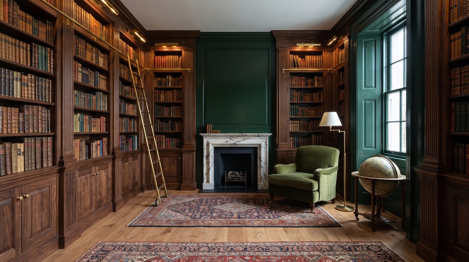
The same law works for quiet colours — grey-blue, grass green, warm honey oak. In one of our projects — a family library in a country residence — the client resisted “dark walls” for three months, afraid of gloom. We assembled a panel from European oak under a matte grass tone and worked the fields with brass beading. She spent her first evening in the finished room and said a line I wrote down: “I thought it would be dark. Instead it became deep.” The difference between “dark” and “deep” is exactly the difference between paint and boiserie.
What it’s actually made of — and what it costs
A conversation about panelling is pointless without an honest conversation about material, because this is where the line runs between expensive and “expensive-looking”. There are three tiers, and confusing them is the most common mistake.
Solid wood. A panel cut entirely from oak or walnut. It lives for centuries, can be restored, and is priced accordingly — 20,000 to 40,000 roubles per square metre depending on species, carving and finish. This is the level at which a panel becomes part of the house’s capital, not its finish.
Engineered boards. A face of a precious species — American walnut, mahogany — on a stable oak or MDF core. A reasonable compromise: visually indistinguishable from solid, far more stable against humidity swings, cheaper. This is the type most often justified in a home with underfloor heating.
Veneer on MDF. A thin layer of real wood on a board: oak veneer from around 5,800, walnut about 8,500 roubles per metre. An honest material for large areas and places where solid would be excessive. The trouble starts when it is passed off as solid and painted to hide the edge. Then, within a year or two, the joints “drift” and the whole room instantly loses its class.
Here is where most people go wrong. They economise not on area but on place: ordering cheap veneer for every wall instead of honest solid wood for one accent wall. The right move is the opposite — one flawless boiserie wall in the main room will say more about a house than “economy” panels around the whole perimeter. The material does not tolerate even economy; it tolerates only concentration.
Myths that make people abandon boiserie for nothing
Myth one: “it’s stuffy and old-fashioned.” What makes it stuffy is not the panel but its layout. Classic floor-to-ceiling boiserie with a heavy cornice really does overload a room. But panelling on the lower third of the wall, slim beading, a plain field painted in a calm tone — this is the language contemporary classicism speaks, and it sounds younger than any “clean loft”.
Myth two: “panels eat space.” The opposite. The vertical rhythm of the fields stretches the wall upward, while a horizontal layout visually widens the room. A panel is not thickness, it is geometry, and good geometry works for volume, not against it.
Myth three: “wood on walls is dated.” Tell that to the rooms where slatted oak panels stand next to concrete and brass. Wood returned to walls precisely because the market grew tired of cold textures: the warm tones of walnut, bleached oak and honey maple once again read as a mark of taste, not archaism. It is not the panel that is dated — it is the bad panel.
Light, parquet and brass: a panel does not live alone
A panel never works on its own — it works in partnership. And three partners decide whether a room will be expensive or merely dark: light, floor and metal.
With light the law is simple: boiserie loves grazing illumination. Direct ceiling light kills relief, turning a field into a flat photograph of itself. But light sliding along the wall — from a narrow niche, from a sconce on the panel itself, from a hidden line behind the cornice — pulls out every edge and gives the depth the panel was built for. We plan this lighting into the electrical design in advance, before the chasing, because “adding a sconce later” means ruining finished joinery.
With the floor, the echo of pattern matters. A chevron or herringbone parquet in the same oak as the panel binds floor and wall into a single material wrapped around the room. But species and tone must either match exactly or contrast honestly — a half-tone miss between “almost the same” oak on floor and wall is spotted instantly and reads as a supply error, not intent.
Brass is the third partner and the chief marker of level. A slim bead set into the joint between fields, the edge of a shelf, the handle of a built-in cabinet in the same metal: brass does not decorate the panel, it “stitches” it, gathering scattered fields into a single composition. In a city apartment with a study we once swapped the walnut’s lacquer finish for matte oil and added exactly three brass lines across the whole wall — the client later assured guests he had “redone everything”, though we touched only the finish and the metal. The expensive often hides in those two millimetres.
Our approach: a panel as part of the architecture, not a sticker on the wall
We design boiserie not at the end, when the walls already stand, but at the very beginning — together with the plan and the sections. Because a true panel must know where the socket will run, how the light will fall, at what height the sofa back will sit, and how a field will meet the chevron of the parquet on the floor. A panel drawn after the renovation always gives itself away: it is “glued on”, not “built in”.
There is a rule we repeat to clients: boiserie is not about wood, it is about proportion. The very same oak board can be laid out to make a room palatial, or laid out to make it quiet and modern. The difference is not in budget but in the pitch of the divisions, the width of the field, where you stop the panel by height. This work — not buying the material but laying it out — is exactly what you pay an architect for. The subtleties of finish, joints and colour matching we work through at the interior decorating stage, and the choice of specific species, factories and supply we run through our own materials and procurement section — where a panel stops being a magazine picture and becomes a specification with species, finish and lead time.
What this looks like in a finished house can be seen in one of our completed interiors, a residence with a library-salon, where panel, bookshelves and colour are gathered into a single shell of the room. There is no “accent wall” glued over the design. There is a wall that is the design.
Why it is once again the mark of an expensive home
Wealth long ago stopped shouting in gilding. Today it speaks more quietly — through a texture that cannot be faked quickly, and work that cannot be bought ready-made. A panel assembled for a specific room, with grain continuing from one board to the next, with a colour found for a specific light, is exactly what cannot be “bought later”. It cannot be ordered from a marketplace and delivered in a week. It requires time, a joiner, and an architect who thought about it from the first drawing.
Minimalism taught us to value emptiness. Boiserie reminds us why a wall exists at all: not to separate one space from another, but to give a room character, depth and age. This is precisely why wine colour and a wooden panel are not nostalgia for the 17th century, but a very sober answer to the question of how to build a house that, twenty years on, will look more expensive than on the day it was handed over.
If you stand before this choice — to leave the walls empty or to give them texture and colour — this is exactly the conversation worth starting before the plaster, not after. We are always glad to discuss it in person, or in our Telegram channel, where we show such solutions on real projects.

Author
Next step
Discuss your project
An hour at the studio with Oleg Reznikov: your site, your brief and relevant studio projects.