
Columns That Carry Meaning, Not a Roof
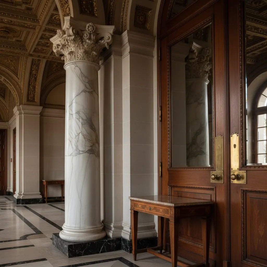
I saw a 50-million-ruble facade that looked like a provincial theater set. The house was made expensively: travertine, bronze hardware, custom Italian windows. But at the entrance—four styrofoam columns, plastered “to look like stone,” with capitals from a catalog. And that’s it. The house is dead. Here begins the conversation about columns, neoclassics, facade, meaning—four words that today determine whether a private home is architecture or stays an expensive fake.
A column is the most honest element in architecture. It either works, or it lies. No middle ground. And the paradox is that it’s the one element commissioned most often today—because “it’s classic,” “it’s prestigious,” “like in Petersburg.” And the result is something that devalues the entire house before the plaster even dries.
Let’s talk specifics: when a column is justified, when it turns into theater prop, and three criteria to tell them apart by the sketch stage—before you pour the foundation.
Myth One: Columns Make the House More Expensive
This is the most common misconception clients bring to the first meeting. “Sergey, add columns—it’ll look more solid.” It’ll be the opposite.
A wrongly placed column isn’t a plus to the facade price, it’s a minus to the whole project. Because it speaks about the owner’s taste louder than everything else combined. A guest drives up to the house and the first thing they read is the proportions of the main entrance. If there’s theater prop there, you can forget the rest: travertine becomes veneer, bronze becomes brass, Italian windows become glass packs.
Architecture changes faster than we think. In 10 years homes with foam order will be perceived the way we see “euro-renovations” of the ’90s with gold ceiling roses today. Not a matter of fashion—a matter of cultural literacy of the next generation of owners.
Where a Column Came From and Why It Matters Today
A column was born not as decoration. It was construction—a load-bearing support that held the entablature, the roof, the whole weight of the building. Greeks spent centuries refining perfect proportions: diameter-to-height ratio, shaft taper, entasis (that subtle convex curve making the column “alive”), capital proportions.
Every proportion responded to function—to carry weight. And that’s exactly why the column is beautiful: its form was an honest reflection of function.
What happens today? A gas-concrete house, a solid belt, the roof sits on walls. The column has nothing to carry. And here’s the split: either we acknowledge the column is now a statement about culture and continuity, and work with it honestly. Or we put it “for looks”—and get theater prop.
We at the studio work from the first principle. The column today is a quotation. And you need to know how to quote.
Three Authenticity Criteria
This is what I check personally on any project—mine or colleagues’.
Criterion One: Tectonic Logic
A column should look like it’s carrying something. Even if structurally it’s not. Above it should be mass—entablature, pediment, balcony, portico. Something that visually justifies its presence.
The most common mistake: columns stand, and above them—nothing. Just a roof overhang or thin canopy. That reads as a set immediately. The eye catches the mismatch in fractions of a second, before the brain even formulates “something’s wrong.”
Criterion Two: Proportion and Module
Each order has its own proportions. Doric: shaft height equals 7-8 diameters. Ionic: 9. Corinthian: 10. Not architectural whim, centuries of proven harmony.
When a client says “make the column taller and thinner, more elegant”—we explain why not. A thin tall column looks sick. A thick short one—crushed. The eye feels it without theory.
Criterion Three: Material and Tactility
A plaster-on-styrofoam column and a limestone column are two different objects, even if visually similar. At five meters distance the difference is already read: in texture, in shadow, in how the material ages in the rain.
Our approach: if budget doesn’t allow natural stone or good concrete—better refuse columns entirely. Replace with pilasters, window rhythm, rustication. Anything that’s honest.
When Neoclassic Columns on a Facade Are Justified, When They Aren’t
Justified:
— when there’s a portico or gallery and the column actually structures the entrance space;
— when the facade is symmetric and colonnade sets rhythm without which composition falls apart;
— when the house is large enough that the column doesn’t look like a toy (below a certain height order doesn’t work physiologically);
— when the site and context allow stepping back from the facade enough to read the colonnade whole.
Not justified:
— on a narrow facade 8-10 meters where two columns look like porch props in a dacha;
— when the client wants “like the Kremlin” but the plot is 12 acres and the house is 300 square meters;
— when structurally the columns can’t get the needed diameter—and they’re “thinned” to the detriment of proportions;
— when the home’s style is eclectic and the order conflicts with other elements.
A story from practice. A client brought us a finished project from another studio—a 450 square meter house with a six-column portico on the main facade. Doric columns, 4.2 meters high, 380 mm diameter. Ratio—nearly 11:1. For Doric—catastrophic: they should be thicker, more squat. On render looked “elegant,” in reality would be a building standing on toothpicks. We reworked: kept four columns, increased diameter to 520, corrected portico height. The house became visually heavier—and finally became itself.
Typical Mistakes We See Every Month
Mistake One: Capitals from a catalog. They order a capital “Corinthian, acanthus leaf, article number such-and-such.” Put it on a shaft that proportionally needs Ionic. The eye doesn’t lie—looks like a foreign head on a foreign body.
Mistake Two: Column without base and without entasis. Straight cylinder from floor to capital. No taper, no profile at bottom. That’s not order, that’s a pipe. Entasis—that barely noticeable bulge in the lower third—is what makes a column alive, not a tube.
Mistake Three: Mixing orders on one facade. Doric below, Ionic above—historically allowed, even canonical (Colosseum). But in a 400-square-meter private house it almost always looks muddled. One facade—one order.
Mistake Four: Columns “glued” to the wall. Half-columns or pilasters that stick out a third of diameter and bear no function—neither visual nor rhythmic. Pure slapped-on.
Mistake Five: Color. White column on white wall—the saddest thing you can do. Column should either contrast the background or have its own texture, different from the wall. Otherwise it disappears.
How We Work with Order at the Studio
The first thing on a project where the client wants neoclassics—we ask: do you need columns at all? In half the cases—no. Neoclassics works beautifully on window proportions, rusticated base, cornices, symmetry. A column is a powerful technique, you apply it where it’s truly needed.
If we decide it’s needed—we start with tectonics. What are they carrying? There should be real-profile entablature with overhang, proper pediment slope (1:4 to 1:6 for classic triangle), cornice with shadow.
Next—material. On our recent projects: limestone, dolomite, premium architectural concrete. Sometimes—glass-fiber concrete if mid-range budget, but with mandatory quality control of molding and finishing.
Last—a scale model or at minimum 1:1 capital mock-up on site. This sounds excessive, but it’s how we avoid surprises. On render proportions are one thing, in reality—different. The human eye experiences architecture differently than a camera.
Where Order Moves in Modern Architecture
We’re on the threshold of new reading of classicism. The era of literal copying ends—the era of smart interpretation comes. The best studios work with order as theme, not as props: simplify capitals to geometric forms, play with proportions within rules, use monochrome and texture instead of molding.
A column in future architecture isn’t a textbook Vignola quote. It’s a reflection on continuity, on heaviness and lightness, on architecture always being a conversation with ancestors. And this conversation matters to conduct only seriously.
In 10-15 years the private architecture market will stratify completely: some homes will read as cultural statements, others—as collections of status decorations. Columns will become one of the main markers of this stratification.
If you’re planning a home and thinking about ordinal elements—come talk before the project goes to work. The best place for an architecture conversation is while everything’s still on paper. On a 50-million-ruble facade, it’s too late to fix mistakes.
Read next
Next step
Discuss your project
An hour at the studio with Oleg Reznikov: your site, your brief and relevant studio projects.