
Emerald Accent Kills Interior for 80 Million — or Saves It?
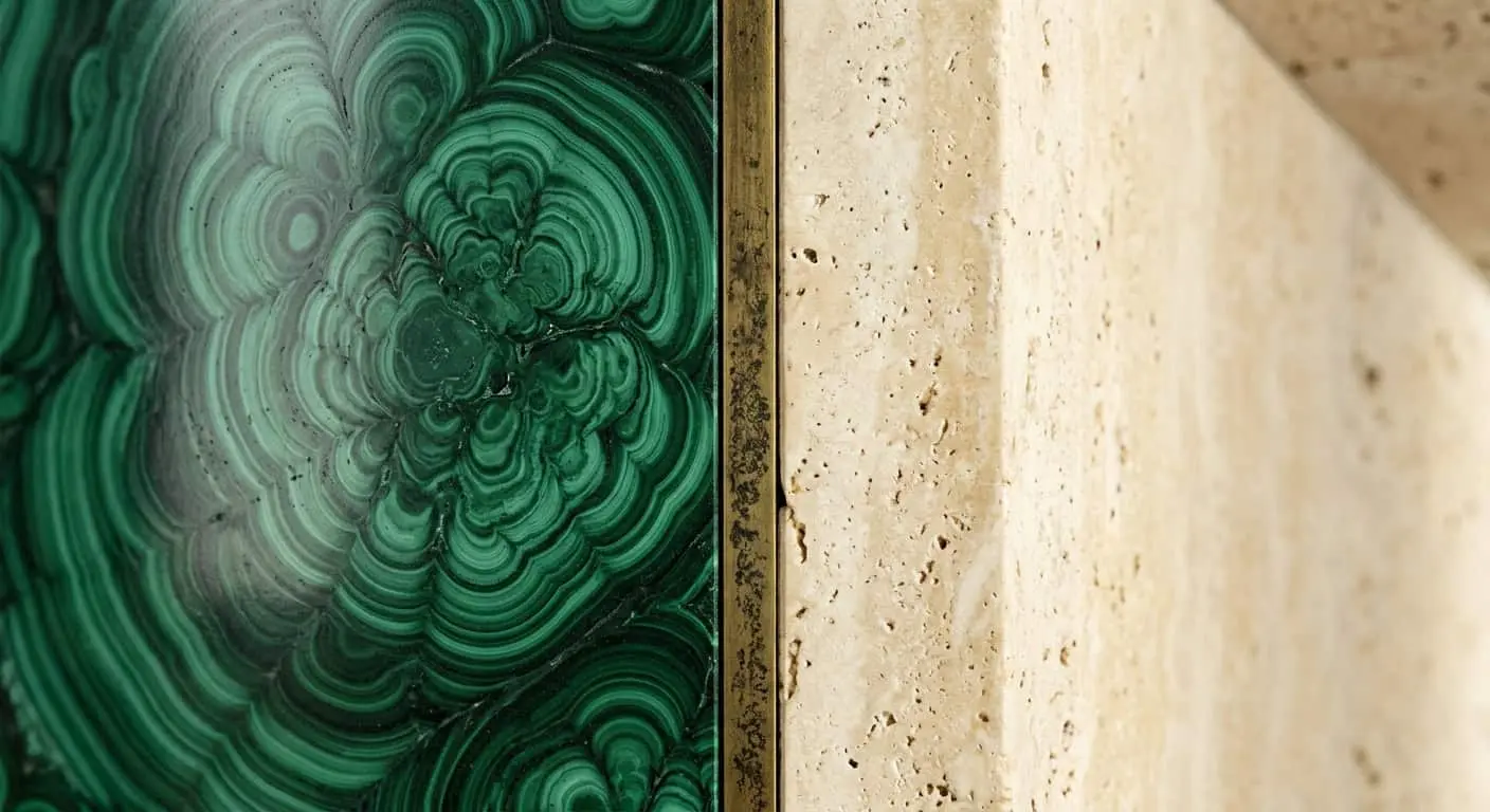
Recently we finished a mansion of 1,400 m². Finishing budget — over 80 million. Double-height hall 9 meters up, limestone staircase, fireplace across the wall. And the client said at the last moment: “Maybe beige instead? I’d feel calmer”. We sat down with her for two hours of conversation. Because if we agreed, we’d get another expensive dead interior — one of those that looks like a hotel lobby closing for renovation tomorrow. Instead, we made an emerald wall behind the fireplace. And it’s exactly this wall that’s the heart of the house today. This article — about why bold accents in mansion interior stopped being a risk and became an architectural decision.
We at the studio watched one scenario for years. Person earns a fortune, builds dream house, hires expensive team — and gets interior where you can’t remember a single detail. Because they’re scared of color. Scared it’ll “get tired”. Scared “they won’t understand”. Scared in five years they’ll have to redo.
Time to take this fear apart. Because in 2026 a beige silent luxury — this isn’t taste anymore. It’s cowardice dressed as restraint.
Where the myth “expensive = no color” came from
Roots are clear. Mid-2010s, Instagram minimalism, Greek villas in stories, “warm botanical” Pinterest. Plus Russian clients’ fear of looking “merchant-like” — trauma from the 90s when hot pink jacket was a taste marker, and everything bright got lumped in the same category.
Result: wealthy audience came to formula: expensive — means invisible. Natural stone in neutral tones, linen, oak, travertine, ivory, greige, greige, greige again. Beautiful in photos? Yes. In life — like living inside a hotel room you can’t check out from.
We call this “showroom syndrome”. Space looks like it was photographed for a catalog, but a person in it — is an extra element.
What changed by 2026
The client changed. People coming to us already built two-three houses. They saw everything — Italian minimalism, French classicism, Japandi. They no longer have the task “prove status”. They have the task — let the house be about them.
And this is where color becomes the only way to say: this is my house, not a demo version.
Second — architecture changed. Mansions of 1,000 m² with double-height halls, 6-meter panoramic glazing, 25-meter enfilades — this scale is where beige simply dissolves. Big volume needs an anchor. A point where the eye stops and understands: I’m here.
Third — we’ve seen enough. Client today leafs not through Russian Pinterest, but through Studio KO archives, Rose Uniacke, Pierre Yovanovitch. And there long been one deep color strike in the right place — it’s standard practice.
Why bold accents in mansion interior work as architecture, not decoration
Here’s what you need to understand. When we say “accent” — we don’t mean a vase or pillow. Pillow is decor. You can remove it. Accent in our sense — it’s color mass tied to architectural element: wall behind fireplace, library niche, panels around staircase run, coffered ceiling in dining room.
Such accent can’t “be moved”. It works like a column or staircase span — structurally.
In the project we started with, emerald wall behind fireplace — 7.2 meters high, Bauwerk lime paint with matte velvety texture applied in four layers. Under certain light angle it goes almost black. At sunset — it glows. This isn’t decor. It’s architectural gesture.
Difference between “painted wall green” and “created color accent” is roughly same as between “laid tiles” and “made a floor”. Sounds the same — done differently.
Three colors we use in mansions most often
Emerald (but not what you’re thinking)
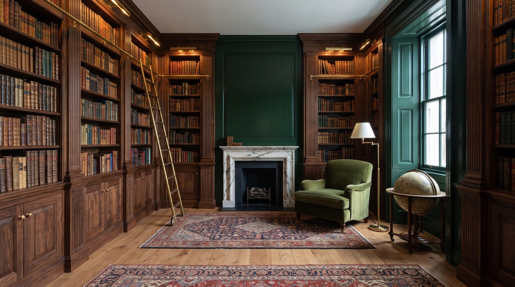
Forget bright grass green. We work with muted emeralds based on complex pigments — something between Farrow & Ball Studio Green, Little Greene Goblin and shades we mix ourselves for specific house light. These colors read at different light sometimes almost black, sometimes deep forest.
Work in libraries, smoking rooms, fireplace panels, baths with natural stone. Killer good with brass, dark oak, Calacatta viola marble.
Terracotta
Most underrated color in Russian interiors. We love it for being warm without sweetness. Not “peach”, not “apricot” — deep clayey terracotta with gray undertone. In marmorino plaster on dining or entry walls it gives effect no “warm beige” gives: space reads inhabited, not freshly handed.
Deep blue
Hardest here. Blue easily dies — it goes either “boy’s nursery” or “corporate”. We work with shades on the edge of blue and black: ink, Prussian, midnight. Best use — offices, wine cellars, rarely — bedrooms with dark floors and bronze.
Bold accents in mansion interior: where they work, where — never
Several places where accent almost always hits.
Double-height hall. One wall out of five or six — decisive. Usually the one the eye lands on from staircase or entry group. Rest stay neutral: plaster, stone, wood.
Dining room. This is evening zone, candles, long conversations. Beige dining room — no one lingers. Deep color on walls — guests sit till two in the morning.
Library or office. Here color also functions: it immerses. Hard to think in white room.
Guest powder room. Paradoxically, boldest bathroom in house is the little guest one. That’s exactly what guests remember. We did 4 m² powder room in terracotta marmorino with alabaster light — client still says it’s most discussed room in 1,300 m² house.
But where accent almost always — mistake:
— Master bedroom. Here need quiet.
— Nursery. Kids grow, color stays.
— Kitchen (work zone). Color interferes with function.
— Hallways without daylight. Deep color in darkness becomes dirt.
Five mistakes after which color truly kills interior
Over ten years we’ve seen everything. Here’s what goes wrong most often.
Mistake 1. Accent without mass. One emerald pillow and one emerald chair in beige room — this isn’t accent, it’s accident. Color should be either architectural (wall, niche, ceiling), or it shouldn’t be at all.
Mistake 2. Three accents in one room. Emerald wall, terracotta sofa, blue curtains — this isn’t boldness, this is visual chaos. Rule is simple: one strike per zone. Rest — support.
Mistake 3. Color from catalog without site test. Farrow & Ball Studio Green in catalog and same on 7-meter wall in double-height hall with northern light — these are two different colors. We always paint sample blocks minimum 2×2 meters and look at three lights: morning, day, artificial evening. Without this — lottery.
Mistake 4. Cheap paint on bold color. On neutral tones cheap matte paint somehow lives. On deep emerald or ink — it looks like gouache from kids’ craft kit. Bold accent needs either lime paint (Bauwerk, Kalklitir), premium matte enamels, or decorative plaster. This isn’t whim — it’s pigment physics.
Mistake 5. Color without texture. Flat smooth wall in saturated color — boring and flat. Same color in marmorino, tadelakt, lime texture — it lives. Plays with light. Changes during day. This is what makes 80-million interior into its imitation.
How we work with color in the studio
Short algorithm we use to decide about bold accent in a project.
First — architectural recon. Which wall looks at what? What light there, what time? What opens from windows — forest, lawn, water, neighbor’s fence? All these factors determine which pigment “sits”.
Then — client portrait. Not “what’s your favorite color”, but what do you love doing evenings, what music you listen, where you vacation. Person who loves Highlands and person who loves Provence — these are two different accents, even if both want “something green”.
Next — physical samples. We never show color on monitor. Ever. Only paint-outs on site, together with stone, wood, fabric pieces going into the room. Light in house always different than showroom.
Only then — decision. Sometimes it’s: “this project doesn’t need bold accent”. That’s also normal answer. Not every house is about color. But if it is — economizing on this decision is impossible.
Answer to main fear: “What if I get tired of it?”
This is question number one. Honest answer: correctly chosen deep color doesn’t bore because it doesn’t shout.
Bores turquoise wall with shine. Bores fuchsia. Bores everything that was fashionable in specific season. But complex emerald on lime, terracotta in marmorino, ink blue on matte enamel — these are colors that lived in European interiors 200 years ago and will live another 200. Not because of fashion. Because of depth.
And what we noticed over practice years: clients who dared bold accents in mansion interior, they come back for next projects and ask “bolder”. Those who chose safe beige, in three years call saying “feels like something’s missing”. That missing thing is exactly the boldness they didn’t allow themselves.
Conclusion: color as signature
Good house — it’s house with character. And character can’t be built from neutral tones alone, just like you can’t write a novel with one word “good”.
Bold accents in mansion interior — it’s not about 2026 fashion. It’s about 1,200-meter space being yours, not someone’s template. About guest entering the hall and remembering not “how rich” but “how precise”. Difference is huge.
If you’re now at project stage and catching yourself thinking “maybe beige instead, I’d be more comfortable” — stop for a second. Ask yourself: is this really your taste? Or is it fear they sold you as taste?
We in the studio are ready for this conversation. Sometimes it takes two hours like with that client. Sometimes — three meetings. But the result is worth it: house you want to return to, not house afraid to get dirty.

Author
Next step
Discuss your project
An hour at the studio with Oleg Reznikov: your site, your brief and relevant studio projects.