
Emerald or Anthracite: Which Accent Will Kill 80 Million Interior
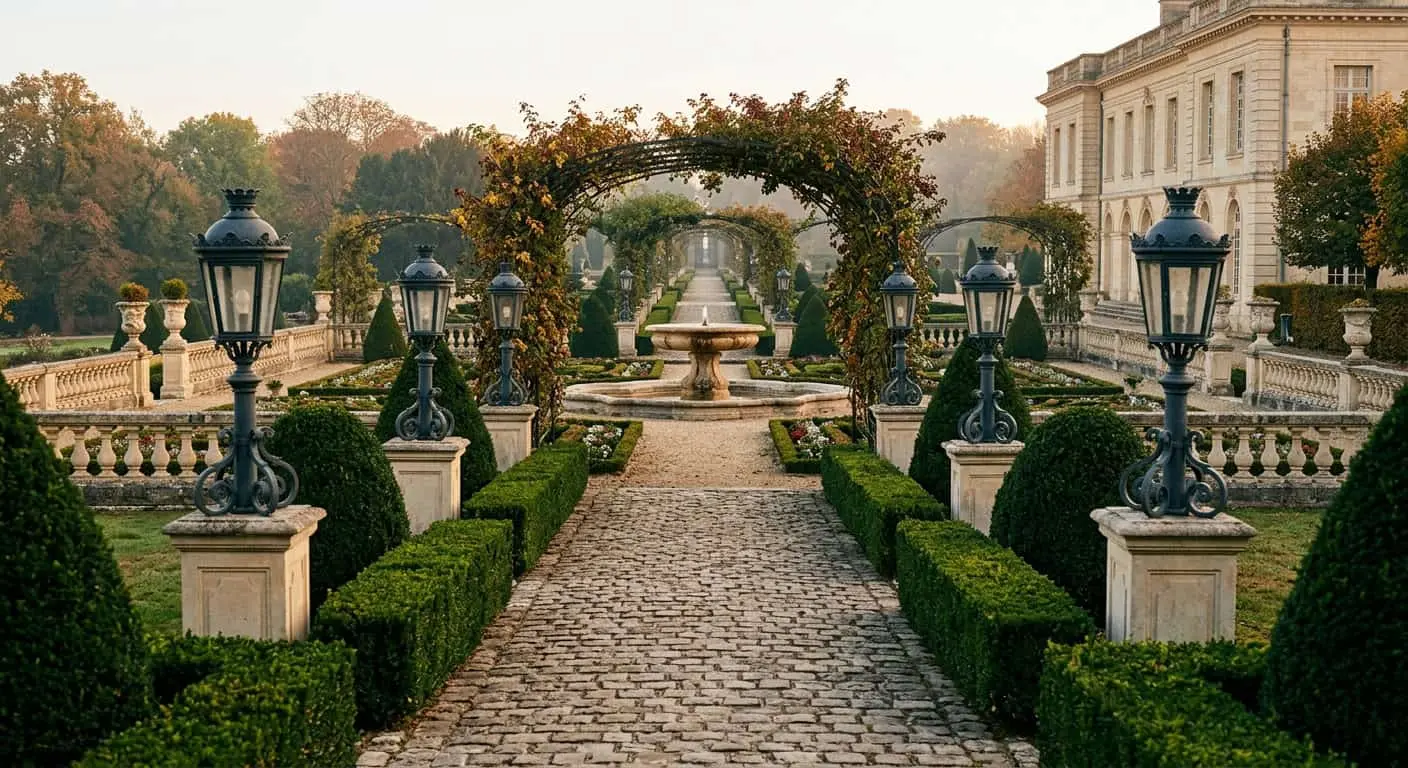
We’re often called with identical request: “Want something bold. Not like everyone else”. Then pause, and client says word that makes us eye twitch slightly. Most often — “emerald”. Sometimes — “burgundy”. Rarely but with same confidence — “mustard”. We’re talking not pillows on sofa, but hall panels six meters high, island counters from solid wood or entire office wall. In other words — what you later can’t move without a crew and two weeks of dust. This is when main conversation begins — about bold accents in mansion interior that either hold house for decades or turn it into decoration to match 2019 series.
We’ve done private houses from 600 m² for almost fifteen years. And can say straight: accent color choice — not question of taste. It’s question of strategy. Because 80-million mansion — it’s not just living environment, it’s asset. Asset has liquidity. And surprisingly, that depends on hue of your dining boiserie.
In this article — why one accent works for house image in ten years, second ages before grout dries. We’ll break down on examples, on numbers, on what premium real estate appraisers tell us not at presentations, but over coffee.
Myth almost everyone believes
Popular belief goes: “In mansion accent always fits if made from expensive material”. Like if it’s not “Leroy Merlin” paint but hand-applied Venetian plaster or rosewood veneer, any color automatically becomes noble.
This is false.
Material defines tactility and depth. But color defines interior’s shelf life. You can make emerald wall from most expensive silk velvet on backing — in seven years it will look like restaurant decoration that closed for “concept failed”. Or you can paint wall ordinary matte in right graphite — it will live with house twenty years, only growing more noble.
Expensive material doesn’t save bad color choice. It only makes mistake expensive.
Why accent color choice — not taste question but liquidity question
Here’s what premium-segment appraisers tell us regularly. When 80–150-million object hits secondary market, it has two fates. First: buyer comes and says “like it, keep as is”. Second: “tearing it all down, redoing” — and automatically minus 15–25% from value, because new owner budgets renovation into negotiation.
So here’s statistics from our partner brokers: homes with “trendy” color accents — emerald, dusty rose, terracotta, mustard — almost always take second scenario. Homes with noble neutral base and pinpoint accents in deep “archive” tones — dark graphite, complex beige, muted ochre, real black — always take first.
Money difference — tens of millions. Difference in decision — think well once about palette.
This is what architectural Instagram doesn’t tell because beautiful trendy shot brings followers, not liquid asset.
Bold accents in mansion interior: what works for decades
Let’s be specific. We divide all colors suitable for bold accents in mansion interior into three categories.
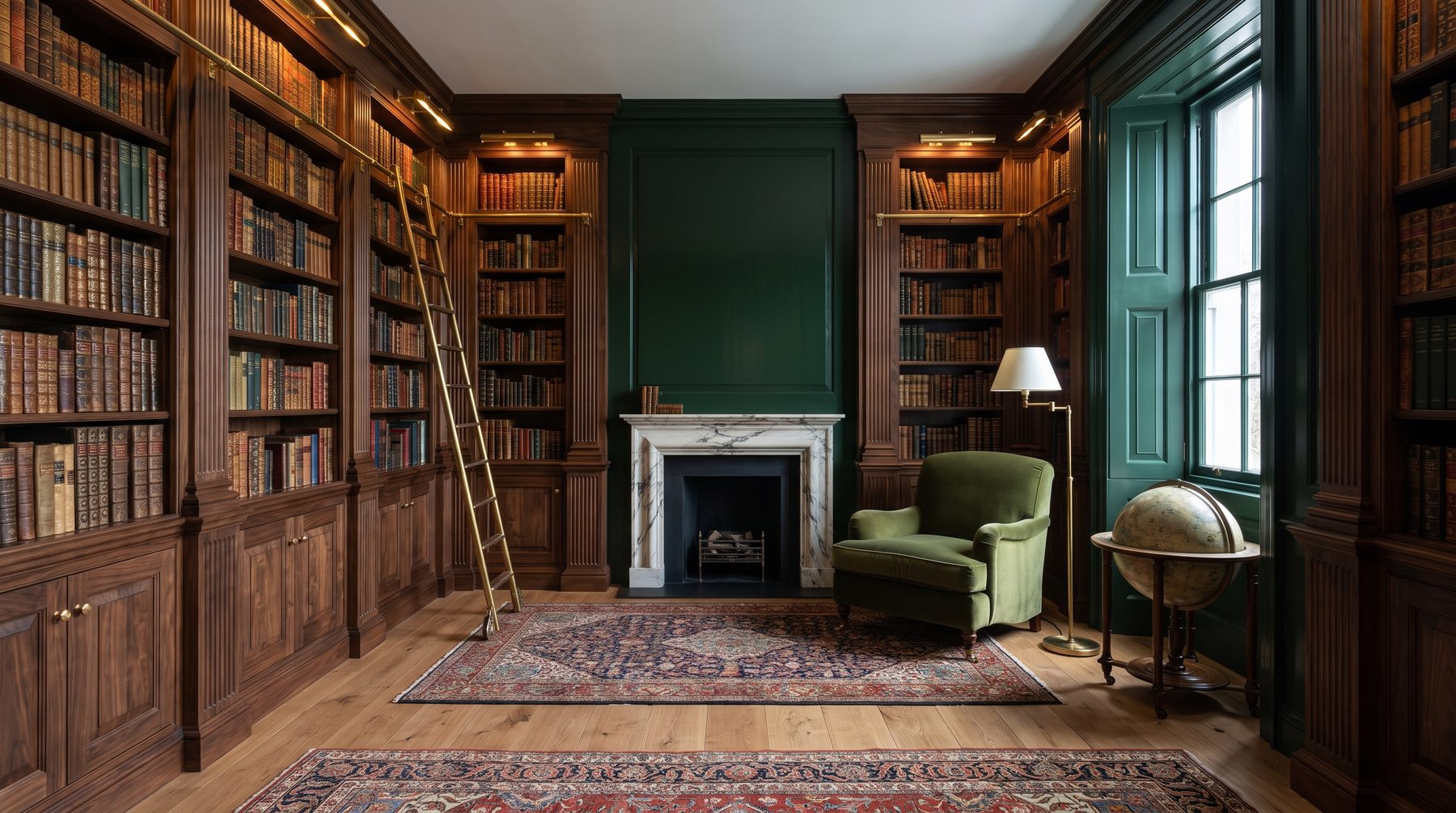
Archive colors. Those existing in architecture minimum hundred years and not associated with any decade. Deep English green (not emerald, but dark hunting). Real black — not gray, but charcoal. Burgundy — but not wine, almost brown like old leather book cover. Dark graphite with blue undertone. Ivory color with yellowing. These colors were in 1920s interiors, 1960s and 2010s — everywhere looked appropriate.
Seasonal colors. Those that came with specific wave and will leave with it. 2015–2020 emerald. Dusty rose. Mint. Sage — which is in peak now, in five years will be what “wenge” became in 2010s. Mustard. Terracotta. These colors shout about renovation date louder than calendar.
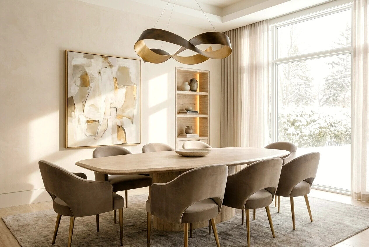
Neutrally-complex. Warm light gray with brown undertone, complex beige, taupe, wet-stone color. Not accents in classic sense, but often work as main tone house lives on.
Back to heading. Emerald or anthracite? Anthracite — archive color. Noble at Adolf Loos, at Armani, at modern Italian bureaus. Doesn’t date interior. Emerald — seasonal. Came with 2017 “botanical luxury” Pinterest wave and leaves with it, leaving behind feeling of “renovation when everyone still wore velvet sofas”.
This doesn’t mean green is forbidden. It means tone matters. Dark hunting green with gray undertone — archive. Bright emerald with blue — seasonal. Difference on palette seems microscopic, but in mansion scale interior becomes decisive.
Story from practice: 12-million hall that needed redoing
Three years ago client came with finished project from another studio. House almost done, finishing touches left. Central hall — double-height, 9 meters up, grand staircase. Project — walls in deep emerald velvet with gold brass hardware.
Renders were, honestly, beautiful. Very restaurant-y. Very “for shooting”.
We said straight: in five years you’ll hate this. In seven — redoing. In ten, if selling, this becomes buyer’s main negotiation point.
Client thought three days and asked to rebuild palette. We went to warm complex beige with milk undertone on main planes, and accented with panels in very dark, almost black oak with greenish tint — not paint, solid wood with natural staining. Left brass but matte, patinated, not polished.
Three years passed. Hall looks like it’s ten years old — in good sense. Already became part of house, not its decoration. And will look equally appropriate in fifteen.
Cost of rebuild at finishing stage — about 1.8 million. Cost this error would have cost at sale in ten years — per broker estimate, around 8–12 million in negotiation.
Typical mistakes even with big budgets
This section, we suspect, many opened article for. So without water.
Mistake one: color picked by render. Render — it’s always lie about color. Perfect light there, perfect calibration, no shadow from bright July sun, no gray November morning. Real interior lives in real light. Emerald in render — gem. Emerald in November at 5 pm — gloomy swamp.
Mistake two: accent picked looking at 10×10 cm sample. Color scales non-linearly. What on 10 cm piece looks “restrained graphite”, on 30 m² wall becomes black hole. We always test colors on 1×1 meter minimum samples — watching under three light sources for minimum two days.
Mistake three: one accent for whole house. Common story: kitchen emerald, office emerald, master bath emerald tile too. Motivation — “unified style”. Result — monotony that quickly bores and makes home predictable. Bold accents in mansion interior should work like events, not wallpaper.
Mistake four: accent for accent’s sake. When client says “need something bold, will be boring otherwise” — red flag. If base is boring, accent won’t save it. If base is complex and layered, accent can be minimal — and still work.
Mistake five: faith in “I’ll live through it”. No you won’t. House with 80 million invested must serve you twenty years. In three years you just won’t each time notice how ridiculous emerald wall looks — but guests will. And buyers will when they come.
How we work with color: our approach
When client comes with request for bold accents in mansion interior, we start not with palette. We start with two questions.
First: is this house for life or investment? If for life 5–7 years then resale, strategy one — maximum neutrality with pinpoint archive accents. If for 20+ years life and passing to kids — can allow more character, but also archive palette.
Second: what do you wear? Sounds strange, works. People whose wardrobe is dominated by navy, gray, beige, inside such house feel at home. People loving bright colors themselves can live organically bolder palette. We’ve never seen interior “re-educate” person.
Next we work in layers. Base — neutral and complex. Furniture and big volumes — same neutral tones but different texture. Accent — one, maximum two per grand zone. Only archive colors.
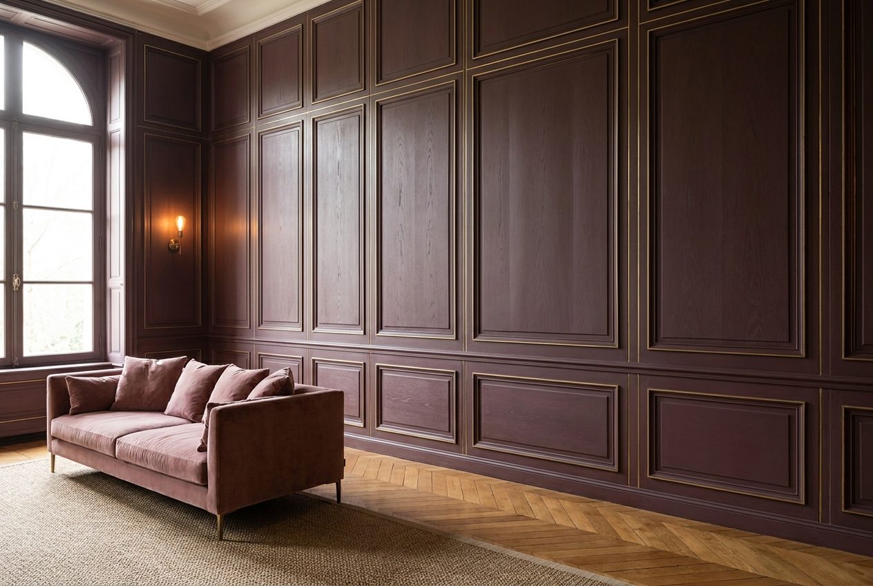
We make accents not with color, but material. American walnut solid. Travertine with live veining. Aged bronze. Fabric with visible weave. This works stronger than any emerald because it’s not color — it’s depth. And depth doesn’t age.
What if really want color
We’re not neutrality fanatics. Sometimes client really needs color — and it’s his house, his right, his pleasure.
Then we agree on zones where seasonal color acceptable. Always — private spaces easy to repaint. Guest bathroom. Boudoir. Wine room. Children’s. Everything not relating to grand core of house and to surfaces hard and expensive to change.
Grand zones — hall, living room, dining, main office, kitchen — always archive palette. Always. This we don’t compromise on, and clients living in houses 5–10 years, grateful for this.
There’s technique we like. Color through art. One large work by contemporary artist in proper frame on neutral wall gives more emotion than whole wall painted year’s trend. And painting, unlike boiserie, you change in an hour.
One more to think about
Bold accents in mansion interior — it’s tool. Like surgeon’s scalpel. Can do fine work, can ruin everything. Difference — in hand and in understanding what exactly you’re doing.
We don’t say house must be beige. We say color in space this scale — it’s minimum ten-year decision, and you make it looking not at fresh Pinterest post but at how house will look when fashion passes, when kids grow, when you yourself tire of what yesterday seemed bold.
Anthracite in ten years — nobility. Emerald in ten years — “should’ve redone”. That’s all the math.
If now you’re at palette choice stage and feel decision more important than seems — write us. We don’t promise agree with all wishes. But promise in ten years you’ll be glad we didn’t.

Author
Next step
Discuss your project
An hour at the studio with Oleg Reznikov: your site, your brief and relevant studio projects.