
The Home Library Returns: Designing the Quietest Room in the House
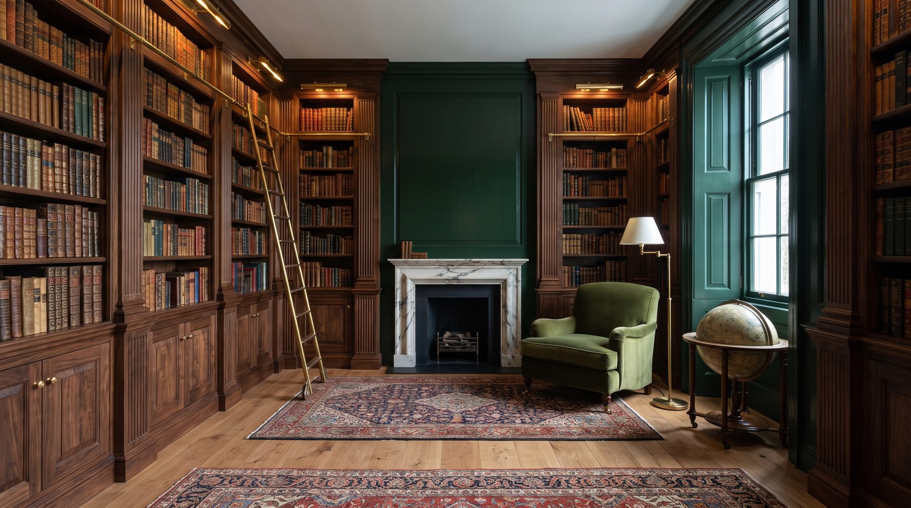
A billion-rouble house is easy to recognise by what it lacks. It has no room where you are not allowed to talk. For twenty years we tore down partitions: the kitchen flowed into the dining room, the dining room into the living room, the living room into a double-height void. We gained space and lost the one thing that does not fit into an open plan — silence with an address. Now the pendulum has swung back. The home library is returning to the private mansion, and the design of a large house increasingly begins not with the formal drawing room but with a room whose door actually closes.
This is not nostalgia for oak panelling and a globe bar. It is a response to how the life of a wealthy person has changed over the past five years.
The room that was struck off the plan
Look at the floor plans of the 2010s. There is almost always a study — 18 to 24 square metres, a desk, a chair, a cabinet for files. There is no library. Books moved into the living-room niches, where they served as texture: a warm murmur of spines behind the owner’s shoulder in the family photograph.
The logic made sense. Books went digital, paper was declared archaic, and a square metre in a house outside Moscow is far too expensive to hand over to silence. The reading room was ruled redundant — much like the smoking room and the ironing room before it.
But this is where it gets interesting. International surveys of 2026 home trends place the private library and the soundproofed study at the very centre of “quiet luxury,” describing them outright as a rebellion against the echoing open-plan volumes that dominated expensive houses for a decade. Not a rebellion against space. Against having no alternative to it.
The reason is simpler than it sounds. The house has stopped being the place people come back to in the evening. It is now where they work, negotiate, make decisions worth hundreds of millions, and recover from them — inside the same walls. In that life, a room where you cannot hear the dishwasher, the children and the voice assistant is worth more than a second dressing room.
The home library in a mansion: design begins with silence
The first thing we explain to a client is that a library is not furniture against a wall. It is an acoustic object.
Two things get confused in every conversation. Sound insulation is the ability of the room’s envelope to keep noise out. Room acoustics is what happens to sound once it is inside. A library needs both, in different ways.
Insulation is honest and dull: the weak point is always the door. A hollow-core interior door on ordinary hinges, with a centimetre gap at the threshold, holds back nothing. We specify a solid leaf, compression seals around the full perimeter, and an automatic drop-down threshold seal that lowers as the door shuts. Beyond that: the frame decoupled from the screed, a separate plasterboard layer on resilient hangers wherever the library shares a wall with the stair hall or the children’s wing.
Interior acoustics are subtler. Instinct says the deader the better. That is wrong. A recording studio works at a reverberation time below 0.3 seconds, and a person in such a room feels physically uneasy: the voice drops, the ears feel plugged, and after twenty minutes you want out. We aim for 0.4 to 0.6 seconds — the room stays alive but stops ringing. The best acoustic material in a library happens to be free: a fully loaded bookcase, with spines at varying depths, works as diffuser and absorber at once. Empty shelves styled with decorative objects do neither. They reflect.
One of our clients, a collector, put it better than any brief: “I need to hear a page turn.”
Climate: the 45 per cent that decides everything
Once a room holds books worth more than a car — and private Russian collections have long passed that mark — you are dealing with engineering, not decoration.
Library and archive institutions broadly agree: 18–22 °C and 45–60 per cent relative humidity. Below 45 per cent, adhesives and leather bindings dry out and paper turns brittle. Above 60 per cent, you have a breeding ground for mould, which can destroy a collection in a single season and cannot be undone. But the numbers are not the point. Conservators say it with one voice: fluctuation does more damage than a steady, imperfect level. Material that expands and contracts in cycles tears itself apart — text blocks warp, spines crack.
Now map that onto a real country house near Moscow. Winter: minus 20 outside, radiators running, indoor humidity down to 20–25 per cent. Summer: 80 per cent outdoors and every window open. An annual swing of 60 points. No collection survives that.
Hence a decision that almost always surprises the client: the library is designed as its own climate zone, with a dedicated humidification circuit, its own air handling and separate humidity control — not as “a room with a radiator.” That belongs in the building services design, not in the finishing stage, because an in-duct humidifier needs space, a drain and treated water. Retrofitting one into a finished house is possible, but it will be expensive and it will look it.
And no, you do not put a library against an external wall without thinking. A dew point inside a construction hidden behind shelving with no ventilated cavity is the single most common answer to “where did the mould on the back panel come from?”
Fifty lux: light that does not eat bindings
The museum standard for works on paper is 50 lux. That is very little — roughly the light of a single candle at arm’s length, the gloom of a gallery alcove. UV-filtering glass blocks 97 to 99 per cent of ultraviolet; ordinary glass blocks almost none. And the cruel part: light damage is cumulative and irreversible. A faded spine never comes back.
The conclusion is not “keep books in the dark” but a proper separation of scenes. In our projects a library always lives in at least three modes.
Reading mode: directional warm light on the chair and desk, 300–500 lux at the page, everything else in half-light. Presence mode: soft shelf lighting that makes the room beautiful without irradiating the spines head-on. Display mode: a vitrine of rare editions where the sources sit outside the case and switch on only when someone is in the room.
Windows are their own story. South and west are the worst orientations for a library: direct sun on the shelves, overheating, fading. North light is even and cool — ideal for reading. If the orientation cannot be changed, the tools are deep reveals, external shutters, UV film on the glazing and heavy motorised curtains tied to a light sensor. All of it belongs in the electrical design, not to an electrician improvising on site: outlets for the drives, warm lamp temperatures, dimming per circuit.
Forty kilos per metre: the engineering everyone forgets
A linear metre of densely packed shelving weighs 30 to 40 kilograms. A four-metre wall, six shelves high, is 24 linear metres — up to a tonne. Dead, permanent load, concentrated in one spot on the plan.
Codes know this. Design live load for reading rooms runs around 2.9 kPa; for book stacks it is 7.2 kPa — two and a half times more. The difference between “a room with books” and “a room of books” is a difference in slab reinforcement.
This is where most people go wrong. A first-floor library tends to be invented after the structure has been calculated, sometimes after it has been poured. Then there are two options: strengthening, or a quiet compromise — “let’s space the shelves out a bit.” We have been there often enough that the wish for “a real library” now goes into the structural design immediately, before the floor slabs are calculated.
Joinery is the second half of the same arithmetic. A 25 mm solid timber shelf spanning more than 800–900 mm starts to sag under books within the first year: you see it against the light and it looks cheap. Our standard is a maximum 900 mm span, verticals at that pitch, a back panel acting as stiffening, and adjustable shelf heights for formats from pocket to folio. All of it is drawn in the interior working drawings, node by node — otherwise the workshop builds it “the usual way,” and the usual way sags.
Five mistakes that turn a library into scenery
Books bought by the metre. The service exists and sells well: “a home library, curated by spine colour.” A room assembled that way is dead. A guest reads it in under a minute — because not one book has ever been opened.
Shelving to the ceiling with no ladder. The top two rows at 2.8 metres become a dust trap. Either a library ladder on a rail, or stop honestly at arm’s reach and put a cornice above.
Glass everywhere. Vitrines belong to rare editions; they genuinely protect from dust and smoke. But a library entirely behind glass stops being a room and becomes a store: nobody picks up a book if a door has to be opened first.
A television over the fireplace. Instant change of genre — the room for silence becomes a second living room and every acoustic effort is cancelled. If a screen is required, hide it in a lift mechanism or give it its own scene.
A library used as a corridor. A room people walk through on their way to the study or the terrace never works. Silence does not survive transit — in twenty years we have not found a single exception.
How we design a room for silence
We do not start with the interior. We start with a question clients are rarely ready for: how many books do you have, and how many will you have in twenty years? “About fifteen hundred” and “eight thousand, and I buy a hundred a year” produce two different houses. In the second case the library dictates its place in the plan, the structure and the services — it becomes the core the rest is built around.
Then the daily scenario. Who uses the room, and when. In one of our projects the owner reads from six in the morning while the house sleeps: the library took the east corner of the ground floor, with a direct door to the garden and its own route past the bedrooms. In another it was a room for two — two armchairs under different light, a table between them, and no sofa at all, because a sofa in a library always turns into seating for guests.
Then materials. Timber is more honest here than stone: oak, walnut and macassar work acoustically and by touch. Heavy textile at the window and a dense rug take the top end off. Colour goes deep — a library is one of the few rooms where dark walls do not shrink the space but gather it. You can see how that plays out at scale in our Palma project, where the library-salon became the main room for receiving guests rather than a technical space: green and cream, shelving on two walls, lighting on separate scenes.
Only at the end comes the content: vitrines, ladder, a globe if it is genuinely yours and not from a curated set. Furniture, light and objects are chosen together, in one wave, because a library does not tolerate being completed in instalments.
Why this will last
The library is not the only room of its kind. Beside it, expensive houses are growing listening lounges with real acoustics, studies with no screens at all, rooms for meditation. They share one trait: they are designed against noise. This is a new typology, and it came out of scarcity, not fashion.
Thirty years ago luxury was floor area. Fifteen years ago it was technology. Today luxury is the ability to become unreachable for two hours without leaving the house. A room that grants that costs less than a swimming pool and changes life more visibly.
And one more thing, less obvious. A library is the only room in a house that grows more valuable with age instead of less. The kitchen dates, the technology is replaced twice, the finishes need renewal. A collection grows with the family and passes on — probably the most honest way to leave your heirs something other than square metres.
If you are thinking about such a room in your own house, write to us or to Oleg on Telegram. We will start with a simple conversation: how many books you own, what time you wake up, and what exactly you want to close the door on. Everything after that is design.

Author
Next step
Discuss your project
An hour at the studio with Oleg Reznikov: your site, your brief and relevant studio projects.