
Indigo in the living room: the color worth 4 million per wall
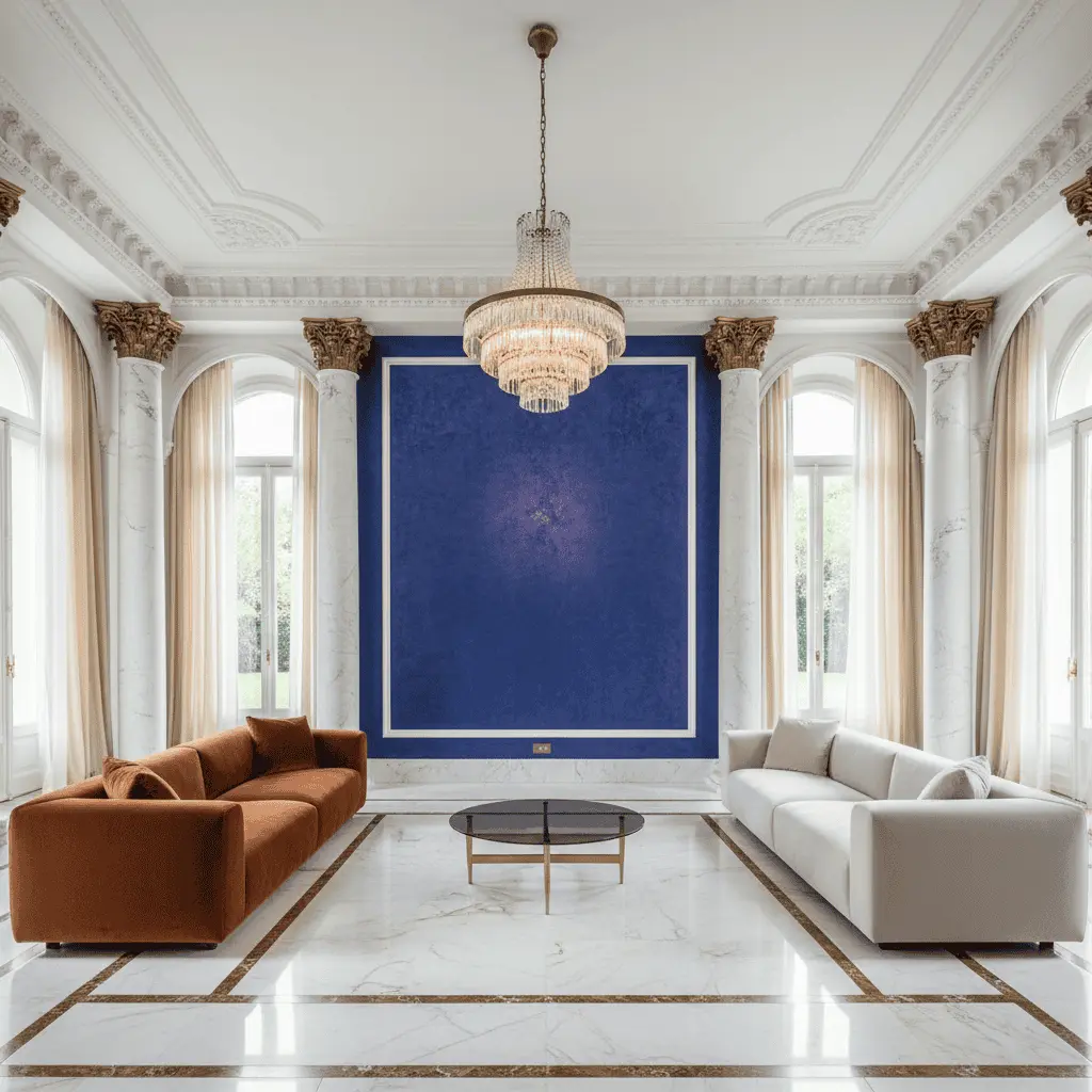
A client once called me at eleven in the evening and said: “Oleg, I want this hall to stop looking like a hotel lobby.” The hall—92 square meters, ceilings 5.2 meters high, panoramic glazing facing the sunset. In this conversation, on the third minute, a solution was born, which we pursued for eight months: indigo interior luxury accent wall—not as a decorator’s trick, but as a structural technique that literally lowered the ceiling, embraced the sofa grouping, and made a gigantic volume intimate. The wall ended up costing four million. And I still believe—those were the most honest expenses in the project.
Indigo is much discussed these days and poorly understood. People confuse it with dark blue, navy, “deep sapphire from the catalog.” Yet indigo is not merely a color. It is a tool. Especially in large halls, where the architect left you five meters of height and the feeling that you live in a museum of contemporary art, minus the art itself.
In this article—why indigo is returning to premium residences, how exactly it works for zoning without partitions, what materials turn color into atmosphere, and where clients most often make mistakes.
Why indigo, not just “dark blue”
The difference between indigo and navy is roughly like the difference between twenty-year-old whiskey and three-year-old whiskey. Both are brown. Beyond that lie the nuances.
Indigo contains a violet undertone. Because of this, it looks almost black in daylight, deep blue-violet in twilight, and velvety, almost tactile under warm evening light. Navy cannot do this. Navy is flat. It remains the same color at any time of day, and in a large hall this kills the atmosphere.
I remember when we made test color samples in one project on Rublyovka. The client insisted on Hague Blue from Farrow & Ball—a classic, everything is clear. We painted a section of wall next to it with indigo on a mineral base with pigment custom-mixed in Italy. By evening she said herself: “Hague is for a minister’s office. But this—this is for living.”
This is what makes indigo a color for architectural application, not for a magazine picture.
Indigo interior luxury: how color works for zoning
Large halls are a problem. Seriously. When you have 80–120 square meters of open space, ceilings over four meters high, and panoramic windows, the living room risks becoming a waiting lounge. People in such spaces subconsciously search for a corner, a niche, something that will “embrace” them.
Previously, this was solved with partitions, glass, multi-level ceilings. Expensive, complex, often—ugly. Now we increasingly solve it with color.
Indigo works as a visual anchor. The dark deep plane “draws in” the gaze, creates a background against which furniture reads as composition, not as a collection of objects. A wall behind the sofa, painted with the right indigo, makes the sofa grouping a separate room—without a single partition.
This is structural use of color. Not “let’s add an accent.” But “let’s divide the hall into two functional zones with this wall.”
Materials: where paint ends and architecture begins
This is where most people go wrong. They think indigo is paint. Buy a can, apply it, done.
No. Indigo in a premium interior is always texture. And it is precisely the texture that accounts for those four million.
Venetian plaster with indigo pigment. Minimum seven layers, the last polished with wax. The wall begins to “breathe”—those same iridescent qualities appear that everything was done for. Work per square meter—from 35 to 80 thousand rubles depending on the craftsman. Good craftsmen exist in Russia, but there are about twenty in the entire country.
Tinted veneer. Oak, stained to indigo, with open pores. Used where we need texture, not flatness. Works fantastically on the ceiling—especially next to brass.
Velvet wall panels. Not to be confused with IKEA upholstery. We’re talking about panels on a rigid frame, covered in mohair or Italian velvet with density from 450 g/m². Absorb sound, create acoustic comfort—critical for halls with large windows and stone floors.
Lacquer surfaces. Twelve layers of polyurethane lacquer with hand polishing. The effect—like a Steinway piano. Expensive, temperamental, unforgettable.
In one project we combined three textures on one wall: plaster as background, veneer insert as “picture,” velvet module behind the television. This was the cost ceiling—four million for twelve meters of wall. But the client still takes guests there and says nothing. The guests say nothing too.
Light: without it indigo is dead
You can get everything right with materials and kill the project with light. I’ve seen this dozens of times.
Indigo requires warm light. 2700K is the ceiling. Better is 2400K. Cold light turns indigo into hospital sadness. This is physics, no use arguing.
There should be at least three sources: general diffuse (but not on the wall!), directed accent (narrow beam, 15–24 degrees, on the texture) and warm decorative backlighting from below or the side—sconces, floor lamps, hidden tape in a niche.
And never—I repeat, never—put track lights aimed directly at a dark textured wall. You will kill all the depth. Light should travel at an angle so the texture casts micro-shadows. Then the wall comes “alive.”
Typical client mistakes
Over twenty years I’ve collected a collection. The most frequent:
“Let’s paint first, then see.” Doesn’t work. Indigo in a can and indigo on a 5-meter wall are two different colors. You need samples minimum 2×2 meters, and you need to look at them at different times of day, minimum three days.
“I want like on Pinterest.” On Pinterest walls are retouched, lit with studio light, and shot with the right lens. In a real hall with north-facing windows, that same wall will look like wet asphalt.
Small wall. Indigo doesn’t work on a 2×2.5 meter fragment. It requires scale. Minimum—an entire wall, floor to ceiling, corner to corner. Otherwise you get a “spot.”
Proximity to cold materials. Gray concrete floor, white quartzite, chrome. All of this kills indigo. Color loves warm companions: oak, brass, cognac leather, linen, wool.
Saving on texture. Paint with matte acrylic “because the difference isn’t visible.” It is. After two months the client calls and says: “Something’s wrong.”
Our approach: how we do it in the studio
We never propose indigo in the first concept version. This is a matter of principle. First—function, planning, light, material palette in neutrals. Then, when the client already sees the house, we return and say: “Now look what happens if we make this wall indigo.”
Next—samples. Always live, always on site, always in real light. Minimum four pigment options, two to three textures. The client should live with these samples for at least a week.
In parallel—light calculation. Sometimes because of indigo we redo the lighting design completely. This is normal. Color at this level is a system, not a finishing solution.
And finally: we always discuss operation. A velvet wall behind the sofa—this is not for a family with three children and a Labrador. Here you need honesty. Indigo is a color for a specific lifestyle. If it’s not yours—we’ll say so first.
When indigo is not needed
This is probably the most important section.
Indigo is not needed in small living rooms. Up to 40 square meters it works against you—eats the air.
Indigo is not needed in halls with southern panoramas and abundant direct light. It will fade, and in five years you’ll get a gray-violet spot instead of a wall.
Indigo is not needed for people who change their interior every three years. This is a long-term investment—materials, textures, light for it. Repainting such a wall afterward—this is not a can of paint, this is demolition.
And finally—indigo is not needed if you want “like the neighbor’s.” This is a very personal color choice. It’s either yours or it’s not.
Instead of a conclusion
That client who called me at eleven in the evening, a year later invited me to dinner. We sat in his new living room, under a velvet indigo wall that in the floor lamp’s light seemed almost alive. He said a phrase I now often repeat: “You know, I thought I was paying for color. It turned out—for silence.”
This is what the right indigo in a large hall really is. Not decoration. Not a trend. Silence you can see.
If you’re building a house with large halls and thinking about color as an architectural tool—let’s talk. We have something to show, and something to warn you about.
Next step
Discuss your project
An hour at the studio with Oleg Reznikov: your site, your brief and relevant studio projects.