
Terracotta in the Living Room: Why the Rich Stopped Fearing Color
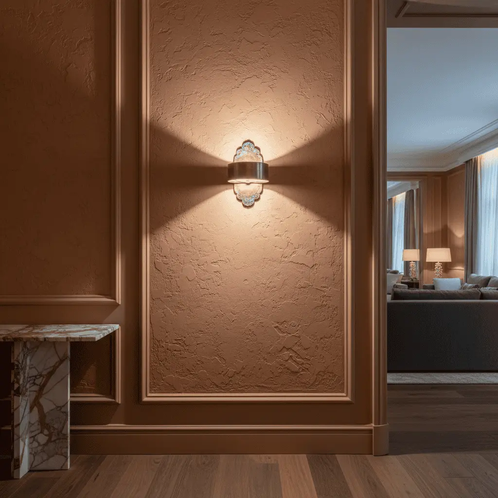
A client is building a house for 500 million. Forty acres, Nikolina Gora, an architect with a name, stone from an Italian quarry. And the living room — beige. Walls beige, sofa beige, curtains half a shade darker. And when I walk into such a space, I don’t see restraint or “good taste” — I see fear. Fear of making a mistake, fear of misunderstanding, fear of stating a position. Terracotta in a luxury-segment living room is today no longer an experiment or designer boldness, it’s a marker of client maturity. And over the last three years we’ve observed a shift that’s been anticipated for a decade.
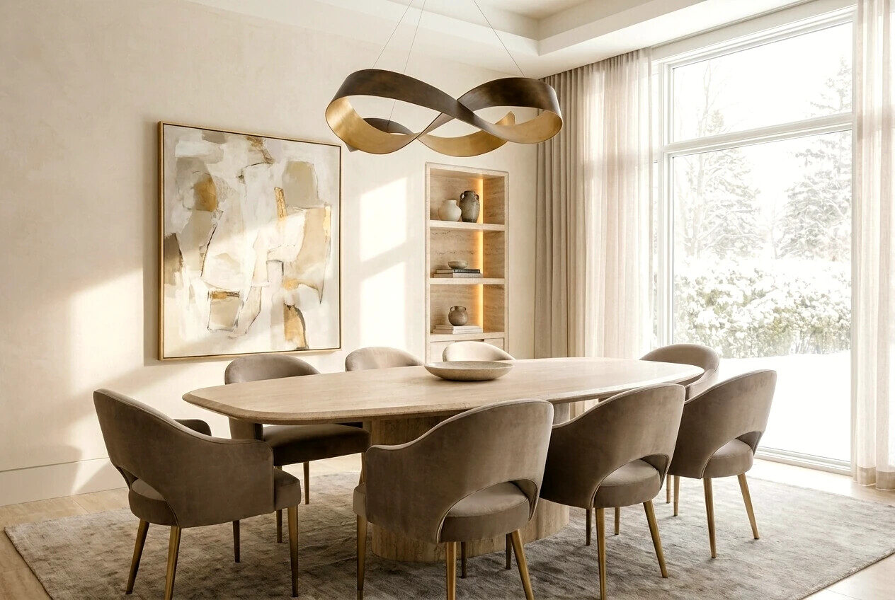
Architecture changes faster than we think, but client psychology changes slowly. The generation that first saw “expensive renovation” in World of Interiors magazine still equates beige with status. Their children — those building their first major houses now — already understand: neutral without character turns a mansion into a hotel lobby. Beautiful, expensive, forgettable. And utterly depersonalized.
This article breaks down where fear of color came from, why it’s dying, how to work with terracotta, indigo, and deep emerald in reception spaces, and where sophistication ends and bad taste begins. Not about trend — trends don’t interest us. About what stays relevant in twenty years.
Where fear of color in Russian luxury came from
The ’90s and 2000s shaped a generation of clients learning taste from magazines. And those magazines sold one idea: expensive means beige, cream, cappuccino. It was reaction to “crimson jackets” and gold cornices. The pendulum swung toward sterility, and stuck.
While European and American architects already in the 2010s returned to saturated palettes — to Florence’s ochres, English manor libraries’ greens, Yves Saint Laurent’s Moroccan terracottas in Marrakech — Russian premium kept polishing beige marble. And mostly still does, especially in “for resale” projects where the designer fears personal investment and the client fears personal choice.
Here’s where people get confused: they mix neutrality with restraint. These are different. Restraint is choice. Neutrality is a choice refusal.
Why terracotta returns now
Burnt clay color has accompanied human architecture roughly four thousand years. Pompeii, Tuscan palazzos, Siena’s Piazza del Campo, Yemen’s adobe walls. This is earth color, color of sun-baked brick, color that human vision reads as “warmth” and “home” at the biological level.
And here’s what’s crucial about terracotta in a luxury-level living room interior: it works not as an accent, but as environment. Not a red wall behind the sofa — it’s the temperature of the whole space. When we lay terracotta Venetian plaster in a reception zone of 80 meters, we get an effect beige can never deliver: the space “embraces.” Evenings under warm light it glows from within. Mornings in north light it acquires the depth of an ancient fresco.
A wealthy client today wants a house to return to, not a house to brag about. This is tectonic shift. And terracotta is one of its material expressions.
The triad of character: terracotta, indigo, emerald
We at the studio call this the “triad of adult colors.” Not because they’re trendy — they’re timeless. Because each carries a cultural code that works long-term.
Terracotta — Mediterranean, earth, craft. Gives space corporeality.
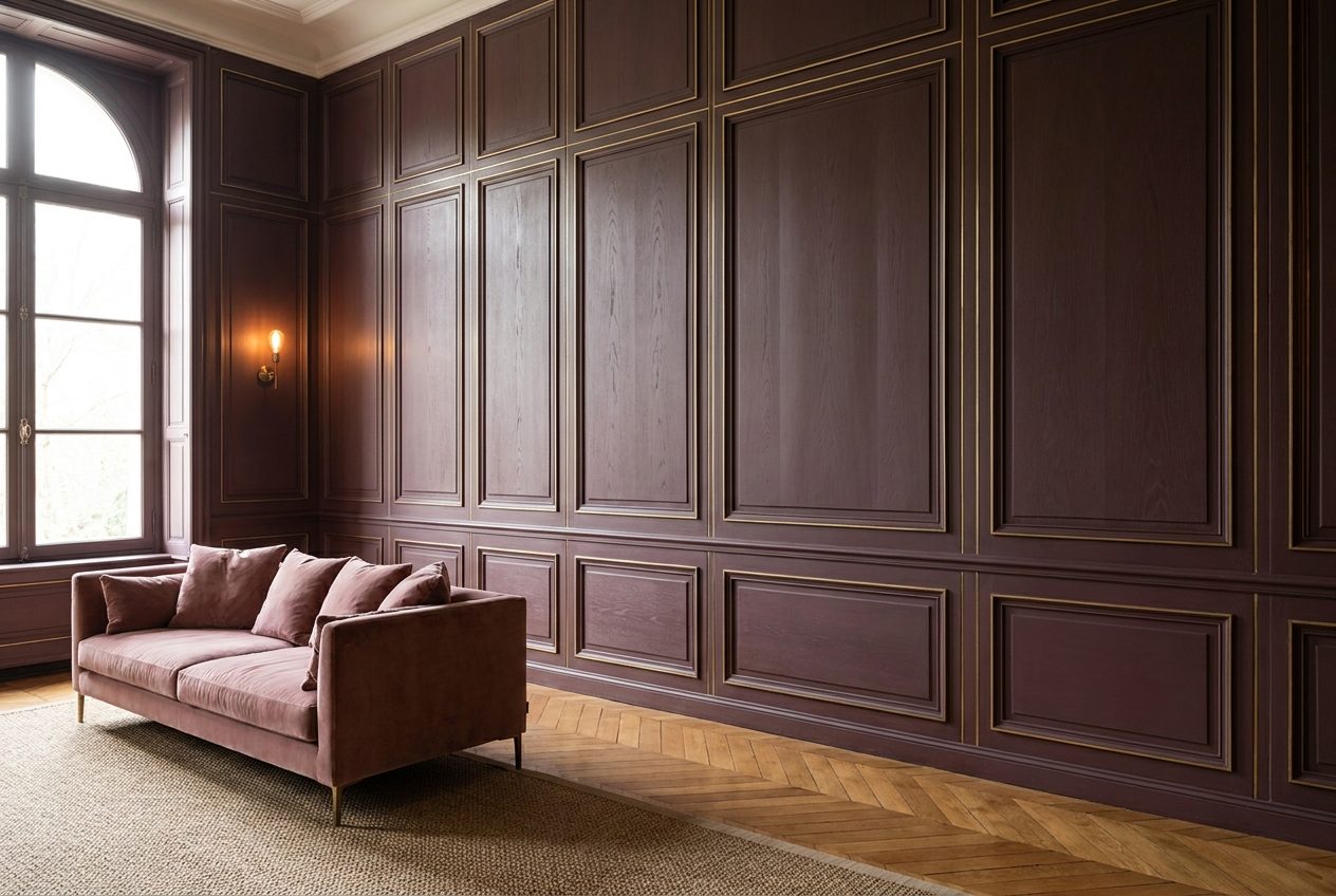
Indigo — noble blue with violet undertone, color of Japanese shibori textiles, color of the East’s night. Gives depth and intellectuality.
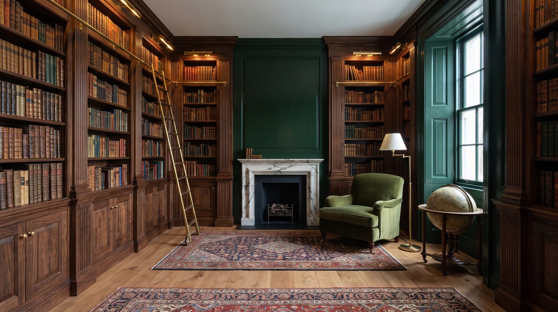
Emerald — Victorian library color, malachite study color, English club color. Gives feeling of stability and breeding.
These three can be combined in one house — terracotta living room, indigo study, emerald library. They don’t conflict because they’re equally saturated in “density” and equally historically rooted. This is where a house with character is born — when each room has its own temperature, but all speak the same language.
How we work with terracotta in reception spaces
Let me describe a concrete project. 900 square meters, Barvikha, client — entrepreneur, 45, second major house. His first, built ten years ago, was all beige. He came saying: “I want it not boring this time.”
Living room 95 meters, 4.2 meter ceiling. We proposed terracotta Venetian plaster on three walls, fourth — floor-to-ceiling panoramic glazing. Fireplace raw travertine. Sofas deep graphite, linen rough-weave. Floor wide oak boards, bleached to “sun-faded” state. One Berber-weave ivory rug. That’s it.
Effect we got: space reads as “Sicilian villa reinterpreted for Moscow climate.” Doesn’t shout color — lives in it. Client after six months wrote that for the first time in his life he spends evenings not in his study, but in the living room.
But here begins the interesting part. Terracotta demands discipline. It’s a color that doesn’t forgive cheap partners.
Materials that work next to terracotta
— Travertine, limestone, sandstone — stones with warm undertone
— Oak, walnut, chestnut — wood with visible texture, no gloss
— Linen, wool, hemp — natural fabrics of rough weave
— Brushed brass, not polished — metal with history
— Handmade ceramics — as counterpoint to smooth surfaces
What kills terracotta: chrome, glossy lacquer, blue-tinted glass, white quartz agglomerate, plastic of any quality. Everything carrying industrial coldness will read as foreign next to terracotta.
Typical mistakes: how not to turn boldness into provincialism
Over ten years we’ve seen attempts to “add color” that ended in disaster. Here are the main traps.
Mistake one: painting one wall. An accent terracotta wall in a beige room — that’s not boldness, it’s compromise. And compromise in color always reads as uncertainty. Either color becomes environment, or it doesn’t exist.
Mistake two: confusing terracotta with orange. Real terracotta is complex, dusty, with gray or pink undertone. “Orange from the hardware store” is a different color and different planet. We always do sample paint-outs minimum A3 size and look under three lighting types: morning, evening, artificial.
Mistake three: overloading with accessories. When the wall already carries character, vases, paintings, pillows should stay silent or whisper. A terracotta living room with ten multicolored pillows isn’t interior, it’s a pillow store.
Mistake four: economizing on plaster. Flat paint kills the whole idea. Terracotta lives through texture — Moroccan tadelakt, Venetian plaster, lime plaster with wax. This is handwork, it’s money, it’s masters. Without it, color is flat like a catalog cover.
Mistake five: fearing darkness. Many clients who commit to color want “lighter so it doesn’t press.” Terracotta should be dense. Thinned-out becomes “salmon,” and that’s medicinal-coat color from the 2000s.
Light is half of color
Hardly anyone talks about this, and it’s a shame. Terracotta living room under cold 4000K LED light becomes a factory cafeteria. Under warm 2700K, directed pointwise — a palazzo.
We specify minimum three lighting scenarios for any colored room: accent light on walls (low-glare fixtures), general diffuse (via ceiling niches or floor lamps), and decorative — sconces, table lamps with fabric shades. A central chandelier in a colored room almost always is a mistake. It concentrates attention wrong.
Our approach: why we discourage beige
At the studio there’s an unspoken rule: if a client says “I want calm and neutral,” we ask one question — “what do you want to feel entering this room?” And ninety percent answer: “coziness,” “warmth,” “want to stay.” Nobody says “sterility” or “like a showroom.”
Beige doesn’t give warmth. Warmth comes from earth color, wood, texture. Beige is absence of decision, disguised as a decision. We don’t impose color, but we show what it does to space and to the human in it. When a client sees the difference between a “beige living room from a developer catalog” and “Vervoordt’s terracotta room” — the choice usually becomes obvious.
We’re approaching a decade when neutral premium will finally give way to premium with character. In ten years a beige living room in a half-billion-ruble mansion will seem as strange as a marble portal with gold curlicues from 2003. This is a matter of time and market saturation.
What outlasts fashion
Color is not fashion. Fashion is a specific season’s shade Pantone announces in December. Terracotta, indigo, emerald — these are color families accompanying architecture for centuries and continuing ahead. They work in the Medici Palace and in a modern house with panoramic glazing. Because they’re rooted not in fashion, but in perception biology and cultural memory.
By choosing saturated earth tone for a reception living room, the client bets not on trend, but on continuity. That in twenty years their house won’t look like “renovated in 2024.” It will look like a house with character. And character doesn’t age out.
If you’re currently at design stage or near final finishing decisions — come talk. We don’t sell color; we help understand what space you need to actually live in. Sometimes it really is beige. More often — something far more interesting.
Next step
Discuss your project
An hour at the studio with Oleg Reznikov: your site, your brief and relevant studio projects.