
The Marble That Kills an Interior: 4 Mistakes with Calacatta
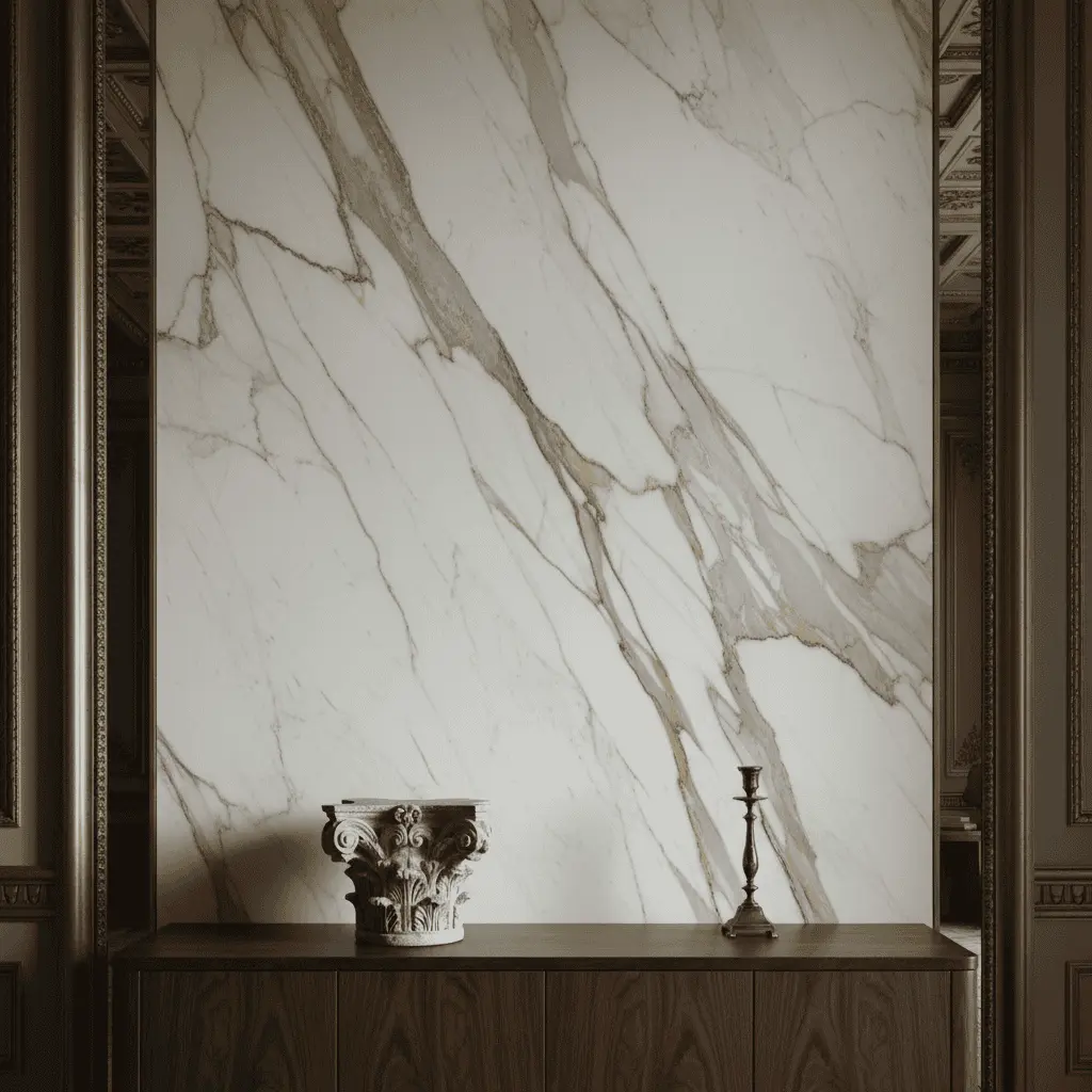
Once a client brought me a sample from Carrara. A slab 3.2 by 1.9 meters, 20mm thick, golden veining of such drama you wanted to applaud. “Oleg, I want this everywhere.” I looked at him and said a phrase after which we almost parted ways: “Then your house will look like a class-A business center in Moscow-City.”
In recent years, Calacatta marble in a mansion interior became a marker. A marker of what — debatable. Status? Taste? Or the fact that you’re finishing an interior for the first time in your life worth what your parents’ apartment was, and you chose the most expensive thing not to miss? The paradox is that Calacatta Gold more often than not destroys the concept of a residence. Not because it’s bad. But because there’s too much of it and it’s in the wrong places.
This article is for those about to invest 100+ million in finishing and want results, not a Radisson lobby. Let’s break down four scenarios where Calacatta kills the interior, and talk about alternatives that professionals choose more than you think.
Why everyone wants exactly Calacatta
Let’s be honest. Calacatta Gold is not about architecture. It’s about recognition. You saw it in the Bulgari hotel, in Minotti presentations, in a neighbor’s Patriarshiye apartment. White field, golden line, feeling of “expensive without explanations.”
And the stone is genuinely beautiful. Mining in the Apuan Alps, limited extraction, a good Extra-class slab costs from 1,200 euros per square meter at entry — and with book-match layout and pattern fitting the figure flies to three, four times higher.
But here’s what I observe in practice over the last seven years. A client comes with Pinterest references where five identical interiors repeat. Kitchen island from Calacatta. Bathroom completely Calacatta, floor-walls-ceiling. Fireplace same. Bar countertop too. By the end the house becomes a catalog of one quarry.
This is not an interior. This is a budget demonstration.
Mistake one: totality
The most common and most painful error — using one stone in all key house points. The client reasons logically: “If the material’s expensive and beautiful, let there be more of it.” Architectural logic is the opposite: the more precious the accent, the less of it there should be.
We had a Gorki-2 project, 1,800 square meters. The client insisted on Calacatta in the kitchen, master bath, guest bath, wine room, and fireplace portal. Five spots. After six months of move-in, she called: “Oleg, I don’t understand why the house looks so… monotonous.”
That’s the answer. Because Calacatta demands context. It works as a solo instrument — not as five violins playing the same part. If you have white marble with gold in the kitchen, in the bathroom you want to see dark onyx, travertine, or Verde Alpi. Not white with gold again.
We at the studio stick to a rule: one dramatic stone per functional zone. Everything else — background: limestone, travertino romano, lime-wash walls, wood. Marble is an exclamation mark. You don’t end every sentence with one.
Mistake two: wrong pattern scale
This is where most people err at the slab selection stage.
Calacatta varies hugely. There’s Calacatta Borghini — large, dramatic, with wide golden rivers. There’s Calacatta Vagli — quieter, thin graphic pattern. There’s Calacatta Oro — warm, with ochre undertone. And when a client says “I want Calacatta,” they usually mean a specific picture from the internet, not understanding what type lies behind it.
Problem: large pattern in a small room kills the space. A 6 m² bathroom lined with Calacatta Borghini with book-match layout — visual chaos. Veins fight the walls, walls fight the floor, the mirror catches it all and doubles it. Client enters and feels unease, doesn’t understand why.
And vice. Thin Calacatta Vagli in a large 80 m² hall reads as a white wall. An expensive white wall. Worth Bentley money.
Simple rule: pattern scale should match room scale and viewing distance. For large portals and walls over 4 meters — Borghini, Monet, dramatic slabs. For baths and local accents — calm varieties or a different stone altogether.
Mistake three: ignoring alternatives
This is where things get truly interesting. Premium segment has marbles that deliver greater architectural expressiveness at the same or lower cost — but they’re chosen less because they’re less “Instagram-able.”
Portoro
Black marble from the Ligurian coast with golden veining. The very stone Carlo Scarpa used. With proper handling — matte finishing, thin joints, delicate lighting — Portoro turns a bathroom into a temple. Not decor. Drama.
Costs comparable to good Calacatta, but gives the interior a depth white marble cannot provide in principle.
Arabescato
Calacatta’s cousin, same region, but fundamentally different graphics. Veining steel-gray, more chaotic, pattern like Japanese calligraphy. Arabescato Corchia or Arabescato Vagli — stone for those with an established eye. A client who chose Arabescato usually already passed the “I want what everyone has” stage.
Verde Alpi
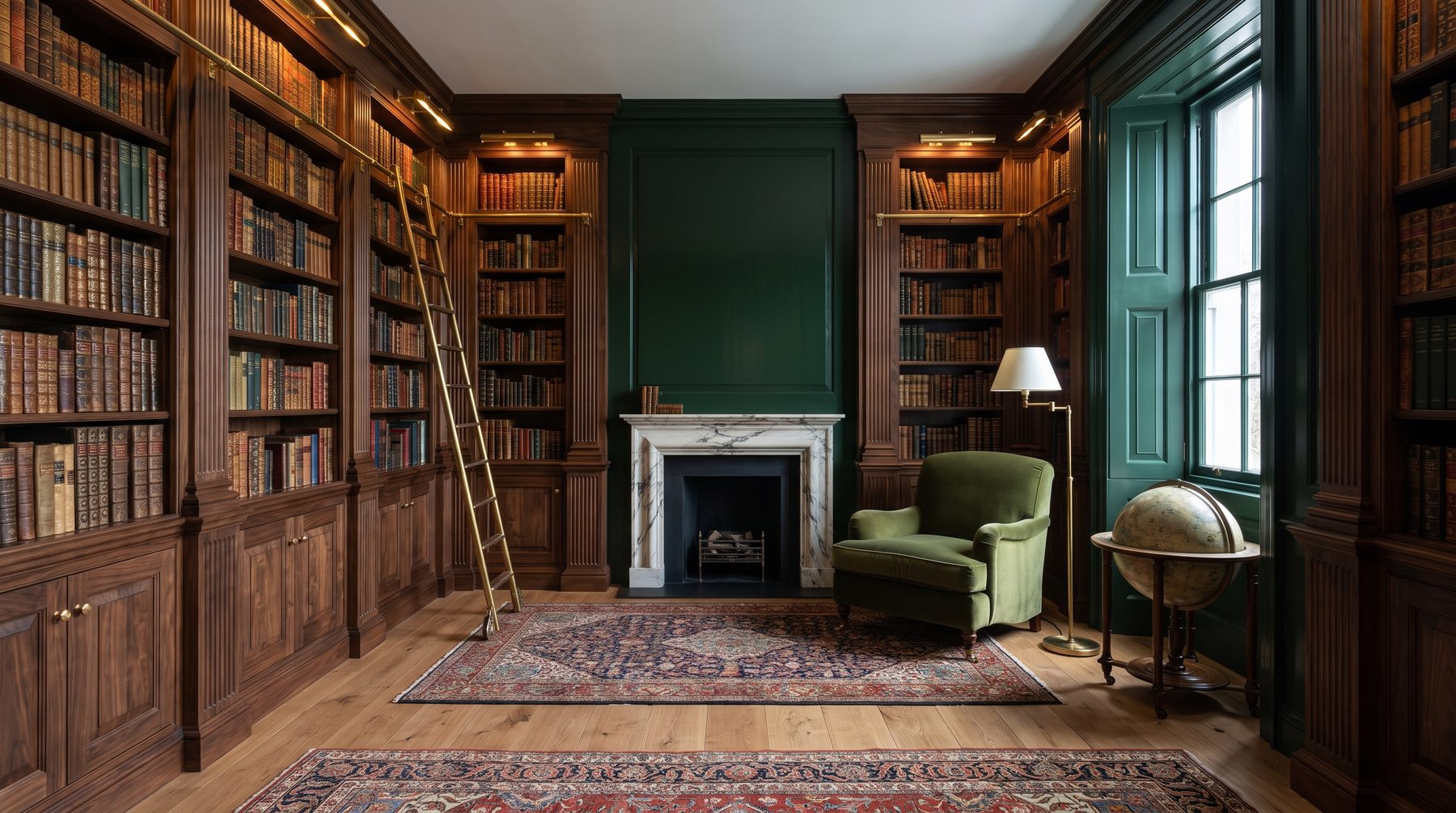
Green alpine marble. The very one returning to world design after forty years of oblivion. Deep emerald background with white and gold cuts. One wall of Verde Alpi in a library — and the interior stops being “just expensive,” it becomes authorial.
In our practice over the last two years, we’ve convinced three clients to swap Calacatta for Verde Alpi in key zones. All three thanked us later.
Mistake four: architectural context mismatch
Calacatta in a mansion interior works when architecture itself calls for it. Classical layout, enfilade, high ceilings, molding, herringbone parquet — yes, Calacatta here is appropriate, it continues Italian tradition.
But we live in an era where 70% of premium residence orders are modern architecture. Modernism, minimalism, Japanese motifs, wabi-sabi. And here Calacatta Gold arrives like an uninvited guest.
Remember a house in Novo-Nikolskoe. Architecture — pure modern minimalism, flat roof, floor-to-ceiling panoramic windows, concrete beams. Client wanted Calacatta Borghini in the kitchen and bath in the finishing stage. We talked him out of it three times. Didn’t succeed.
A year later: “You were right. The stone feels from a different house.” We swapped it for warm travertine with rough treatment and Pietra Serena. The interior came alive.
Moral: stone choice continues architectural concept, not a decorative decision. A cold, geometric house needs characteristic stone, but not Italian classicism. A warm, plastic house — Calacatta might play.
Typical myths clients believe
Myth one: “Calacatta is an investment, it won’t go out of style.” It will. Any material that became mass in premium passes saturation cycles. Calacatta peaked 2015–2022. European projects now increasingly swap it for quieter stones. In five years, apartments filled with Calacatta will read like interiors with gold taps from the 2000s.
Myth two: “White marble is universal.” No. White marble demands perfect light, correct lighting temperature (2700–3000K, not higher), flawless grouting, regular care. Red wine stain on Calacatta — permanent if not treated quickly. Coffee, turmeric, lemon juice — everything leaves marks.
Myth three: “Expensive slab = better result.” Result depends on layout, pattern matching, joint thickness, finishing type (lucido, satinato, antico), and lighting. Cheap Arabescato in skilled hands looks costlier than top Calacatta laid like subway tile.
How we work with marble at the studio
Briefly on our approach. We never choose stone at render stage. Only live, on a warehouse, with a flashlight and water. We wet the slab — shows how it looks after polishing and through years of use.
We compose a material palette for the house before the client starts falling in love with specific slabs. The palette usually has 4–6 key materials: main floor stone, accent marble, wood, metal, fabrics, plaster. All must work as a chord.
We deliberately use Calacatta less than competitors. Not because it’s bad. Because in 8 of 10 cases a more precise solution exists for the project. Portoro for drama. Arabescato for graphics. Verde Alpi for character. Travertino for warmth. Pietra Serena for restraint.
And one more thing. We always warn clients about operating costs. White marble is a commitment. Crystallization every 1.5-2 years, professional cleaning, carefulness in daily life. If the house has kids, a big dog, and a culture of “toss a glass on the island” — maybe honest to choose engineered stone Neolith or Taj Mahal quartz. No one will know, but nerves stay intact.
What’s the bottom line
Calacatta is a beautiful stone. But it stopped being a sign of taste and became a sign of a certain stage. A stage when the client pays for recognition, not architecture.
If you’re building a residence you want to see fresh in ten years — ask yourself one question. Am I choosing this material because it’s best for my task? Or because I’ve seen it everywhere?
An honest answer to that question usually changes the project.
Come by the studio with references — any, even from Pinterest. We won’t argue with you from the doorstep. We’ll lay out ten slab samples and show which one actually makes your house your house. Not a Carrara quarry catalog.
Next step
Discuss your project
An hour at the studio with Oleg Reznikov: your site, your brief and relevant studio projects.